FitTripper
Role
UX/UI Designer
Key Tasks
Qualitative and Quantitative Research
User Testing
High Fidelity Screens
Prototyping
Style Guide and UI Kit
Timeline
4 Weeks
CHALLENGE
Our team of four UX/UI Designers was asked by FitTripper to do a full redesign of their beta app. At the time FitTripper's beta hadn't been launched nor had it been tested with users. Although FitTripper had a website, the owners, Carol and Rob had plans for new features and wanted to explore new style options that could be later implemented across all platforms.
The most important challenge to the client was creating a dynamic design that is intuitive and gender neutral to reflect their users. Carol and Rob wanted FitTripper to be more than just a gym locator and their main asks were:
1. Create a design that is dynamic, intuitive, and colorful yet gender neutral
2. Add in new features to expand FitTripper's reach
3. Make a seamless design system that is accessible and timeless
Below are images of what the FitTripper website looked like at the time
The color palette on the left was used by the client for their original web design. They were considering switching to the new color palette on the right but neither had been tested with users. My goal was to gather insights on which palette would perform best.
APPROACH
Our team began our research with a Visual Competitive Analysis, looking at three direct competitors: Mindbody, Classpass, and Wannatrain. After synthesizing our findings from this analysis as well as keeping our client's needs in mind we created three Design Principles.
VISUAL COMPETITIVE ANALYSIS
DESIGN PRINCIPLES
Dynamic Feel
Create a dynamic feel that evokes a fun flow that reflects the active lifestyle of FitTripper's users.
Familiar Design Patterns
FitTripper's users are constantly on the go. Familiar design patterns will allow users to accomplish their goal smoothly.
SOLUTION
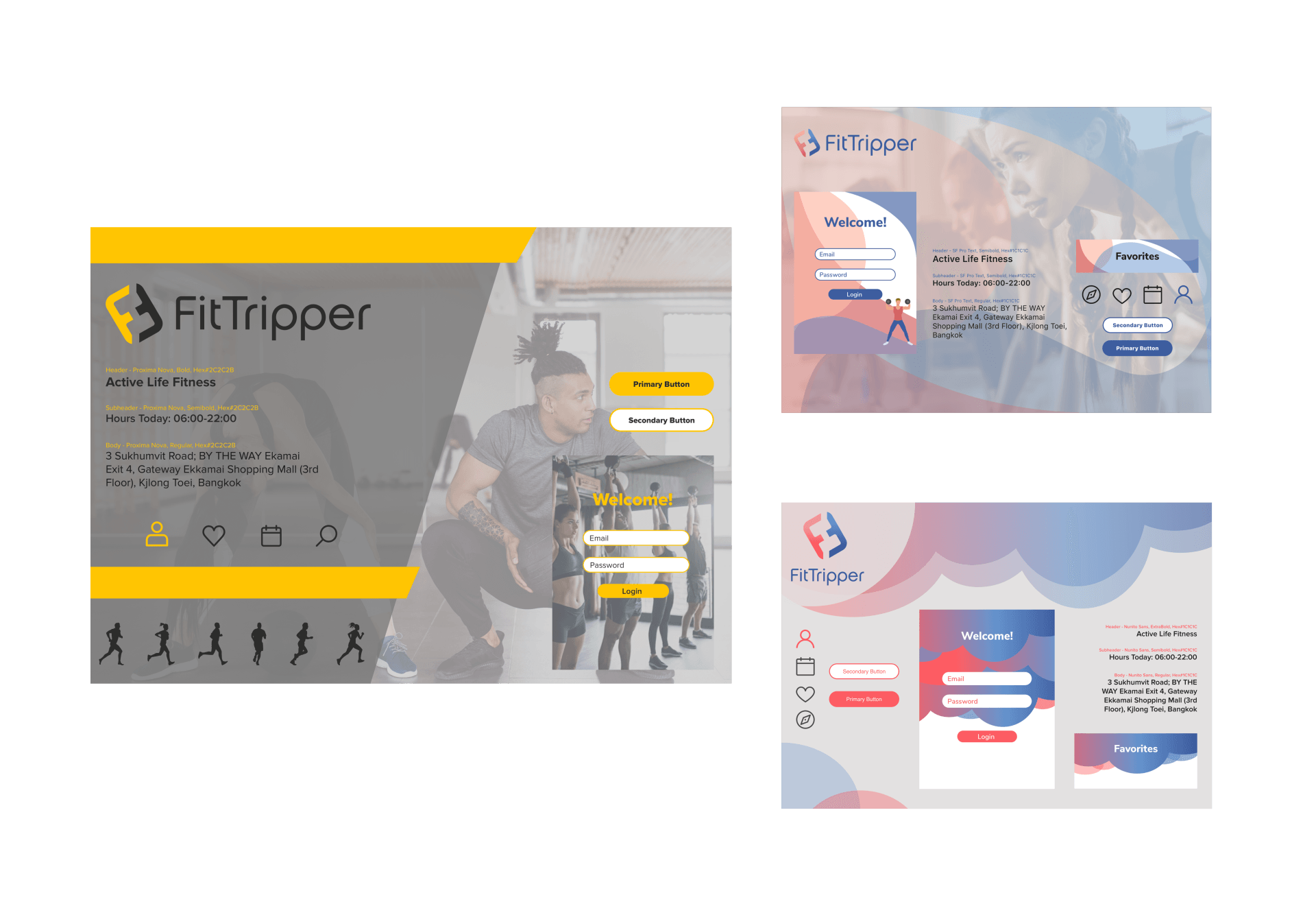
The next step in my design process was to create three divergent style tiles to get quick feedback from users before building high fidelity screens. I wanted to test the two color palettes the client liked as well as a completely different color palette. As FitTripper's app had never been launched, nor had they done any user testing there was a lot of room for experimenting with different styles.
User Feedback
80% of users preferred the gray and yellow style tile due to the high contrast, color palette, and images. 100% of users preferred the use of images over the use of illustrations because they felt more motivating and less childish. Users also responded well to the color palette of the tile on the top right which was the original color palette used by FitTripper.
Client Feedback
The client also preferred the aesthetic of the gray and yellow style tile however they didn't wan't to diverge from their color palettes. I decided to move forward using the look and feel of the gray and yellow style tile but use FitTripper's original color palette.
HIGH FIDELITY SCREENS
01
Original Beta Screens
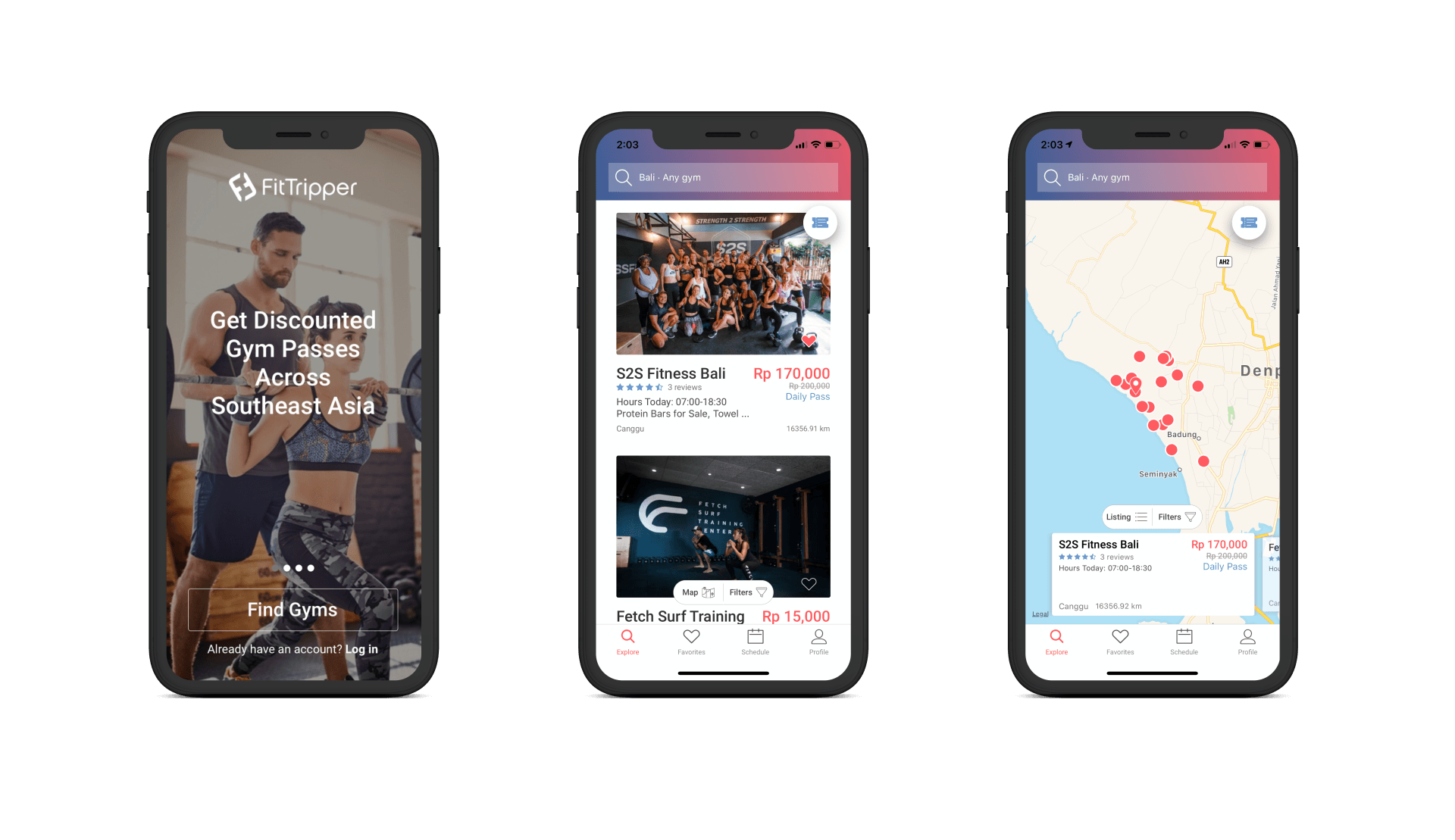
These are FitTripper's original screens that hadn't been tested with users. The client wanted to add additional modules on the explore page so users can easily search from a wider variety of categories. To reiterate, their objects were: to make it more dynamic and colorful.
02
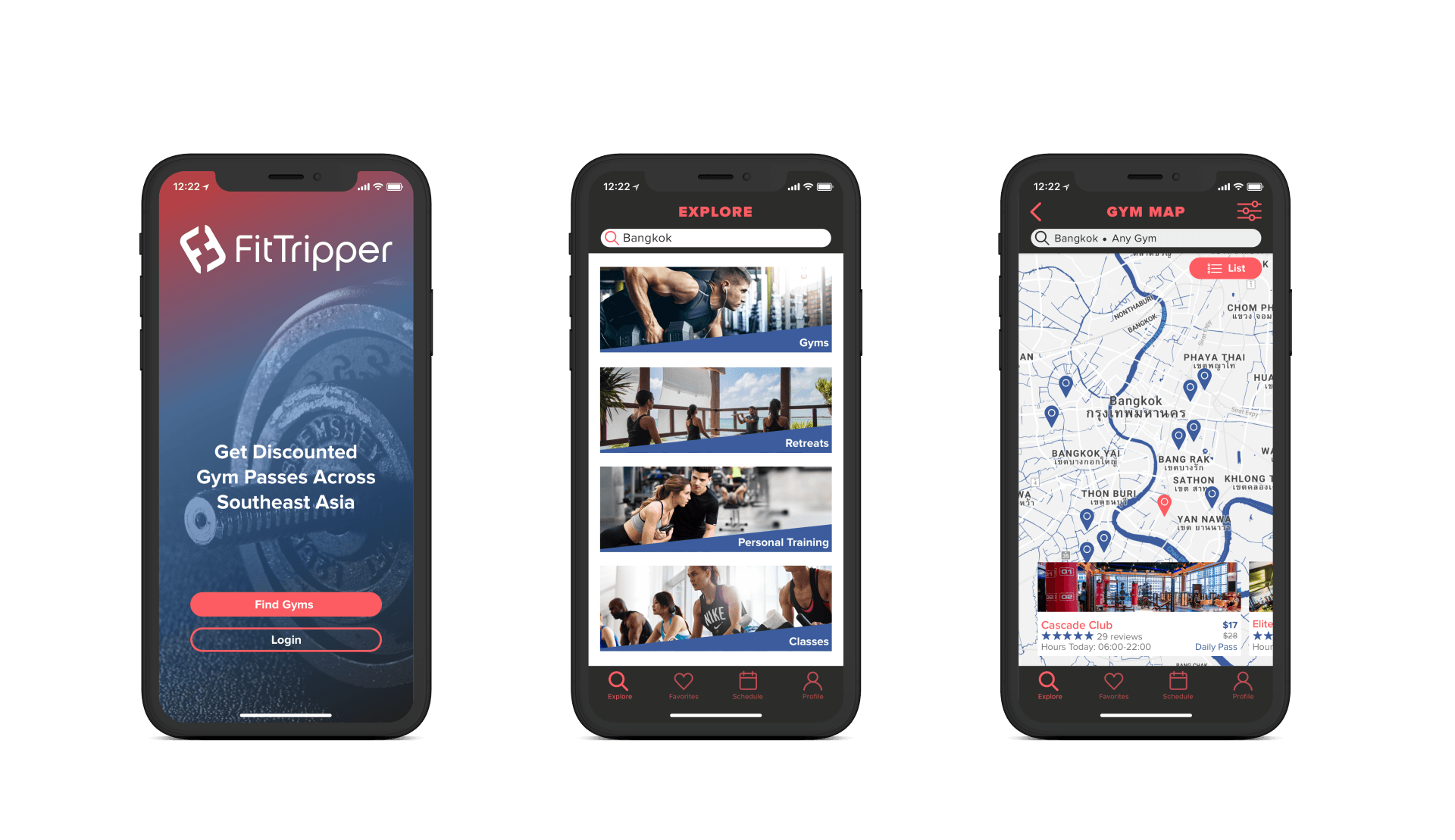
Initial Designs
For these initial designs I wanted to incorporate the original color palette but add in a darker color for contrast to make the colors pop. As users emphasized a preferences for images I wanted to incorporate them wherever possible. I decided to use images for the categories on the explore page to draw in the eye and the blue angled background for a dynamic touch. I also decided to add images on the map cards to give the user a preview making it easier to scroll through.
03
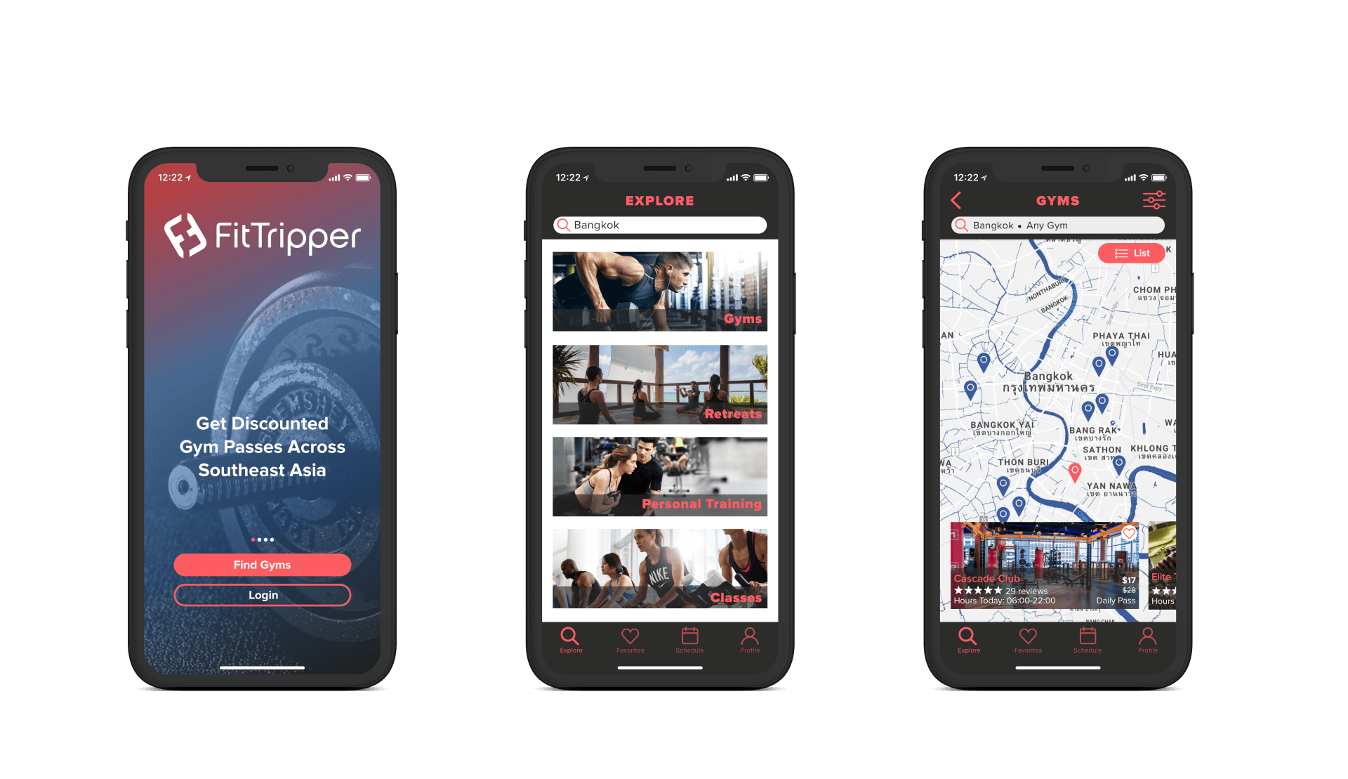
Final Round
After gathering user and client feedback I made final iterations. Users felt that the text on the Explore screen was too small and as I couldn't incorporate the slanted blue text box anywhere else, for consistency I decided to make a black text box with low opacity. I wanted to incorporate this same concept on the Map screen, in order to showcase more of the image as well as make it consistent with the Explore screen. Now more of the images are visible making it even more motivating for the user to scroll through.
PROTOTYPES
Prototypes not available on mobile.
Gym Screens
The user has the ability to toggle between a list and map view for the gym screens making it easier for users to search by location.
The client wanted a better way to organize the information on the gym screen. As seen on the Cascade Club page the user can scroll through the information seamlessly. I incorporated accordions, carousels, and dropdowns. The goal here was to get all of the necessary gym information onto one page while also making it scannable.
Favorites, Schedule, and Profile Screens
The Favorites and Schedule screens are laid out similarly to the other list view screens. I wanted to maintain a consistent look to make it easier for the user to navigate and sort through information.
Onboarding Screens
For the onboarding screens I wanted to incorporate a gradient overlay using FitTripper's colors. As I decided to take the gradient off of the screen headers I wanted to make sure I used it in a new way.
Retreat Screens
The retreats page, like the gym page had a lot of information to add. The challenge was to get all of the necessary information on the page without giving the user cognitive overload. Initially when testing this with users I received feedback that there was too much to read on the page. However when I took this feedback to the client they disagreed because it was necessary to keep all of the information . This is where I incorporated "read more" buttons to allow for condensing the information but still giving the user the option to continue reading.
STYLE GUIDE
I created a style guide to facilitate an easy handoff from the client to their developers. This guide provides a comprehensive design system that FitTripper can implement across all platforms.
Slide title
Write your caption hereButton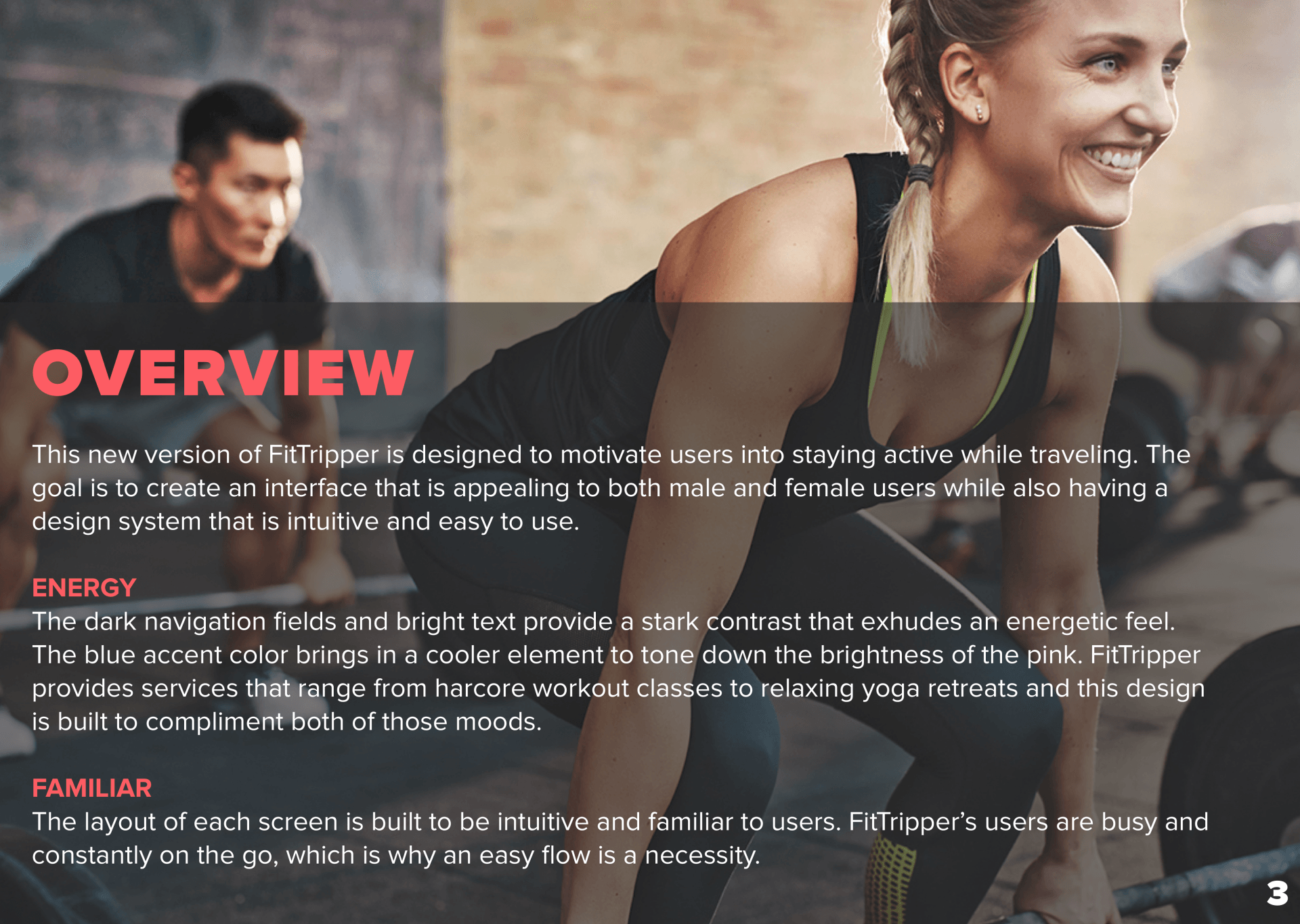
Slide title
Write your caption hereButton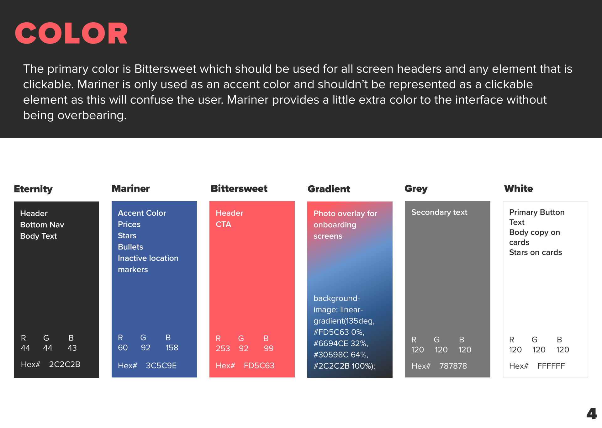
Slide title
Write your caption hereButton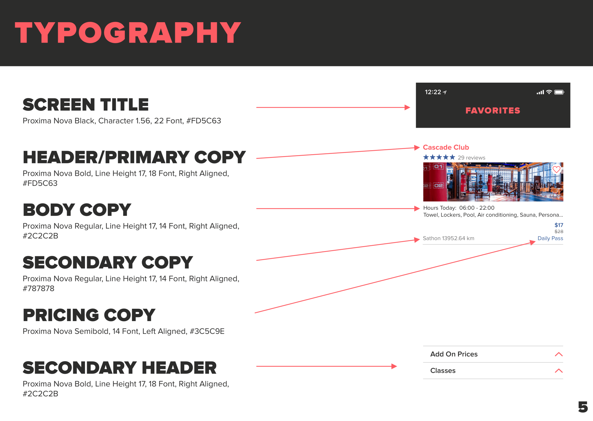
Slide title
Write your caption hereButton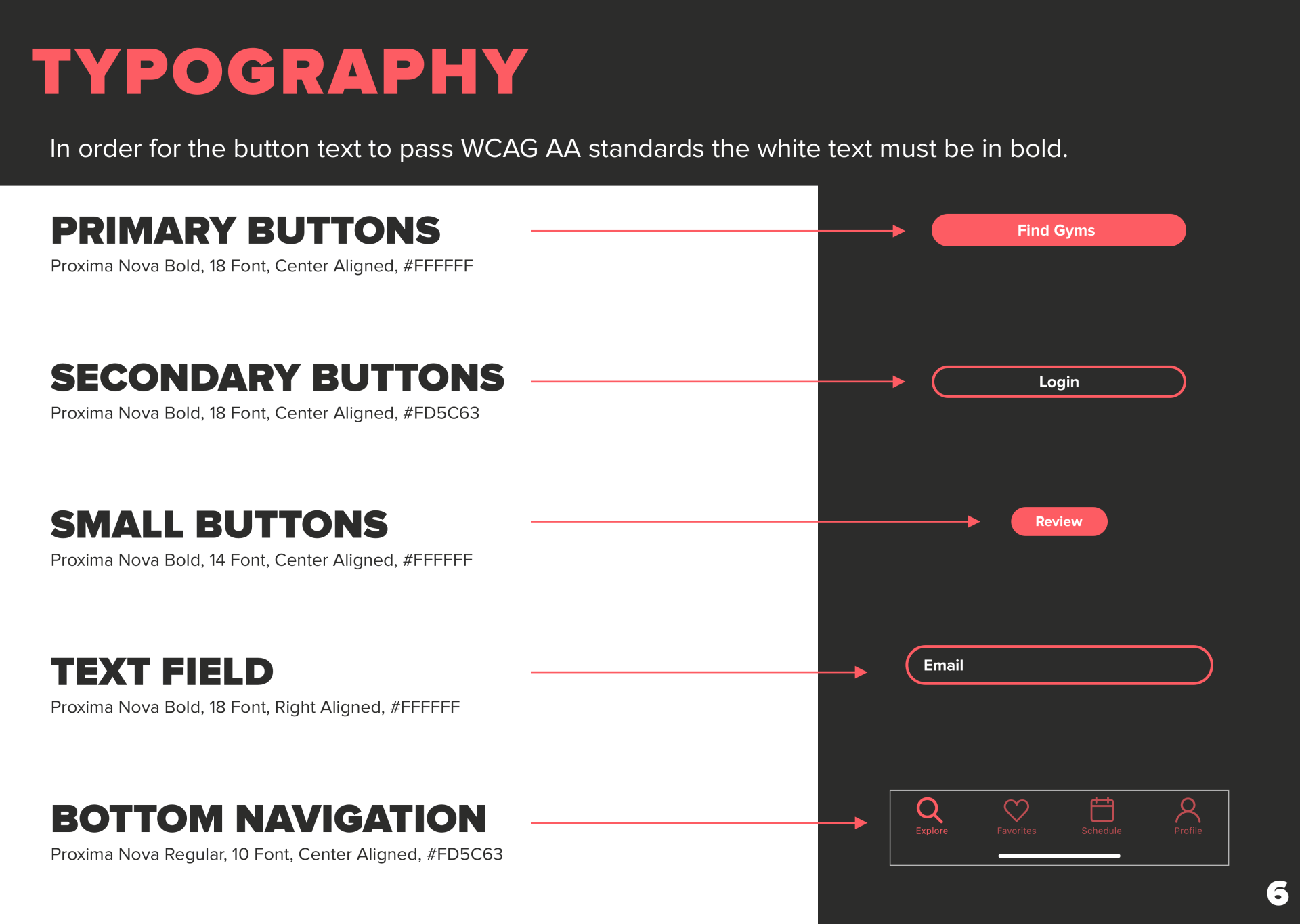
Slide title
Write your caption hereButton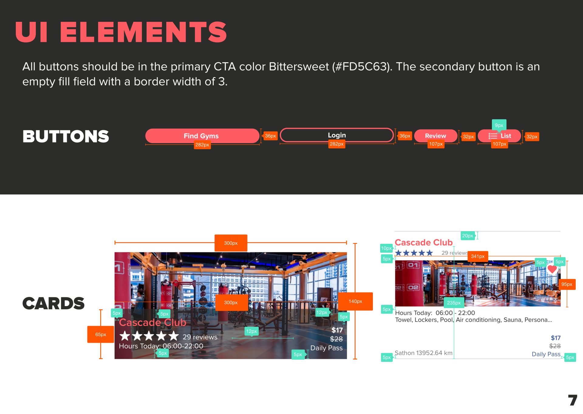
Slide title
Write your caption hereButton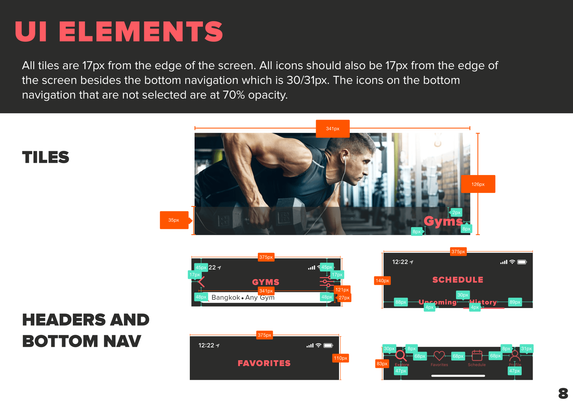
Slide title
Write your caption hereButton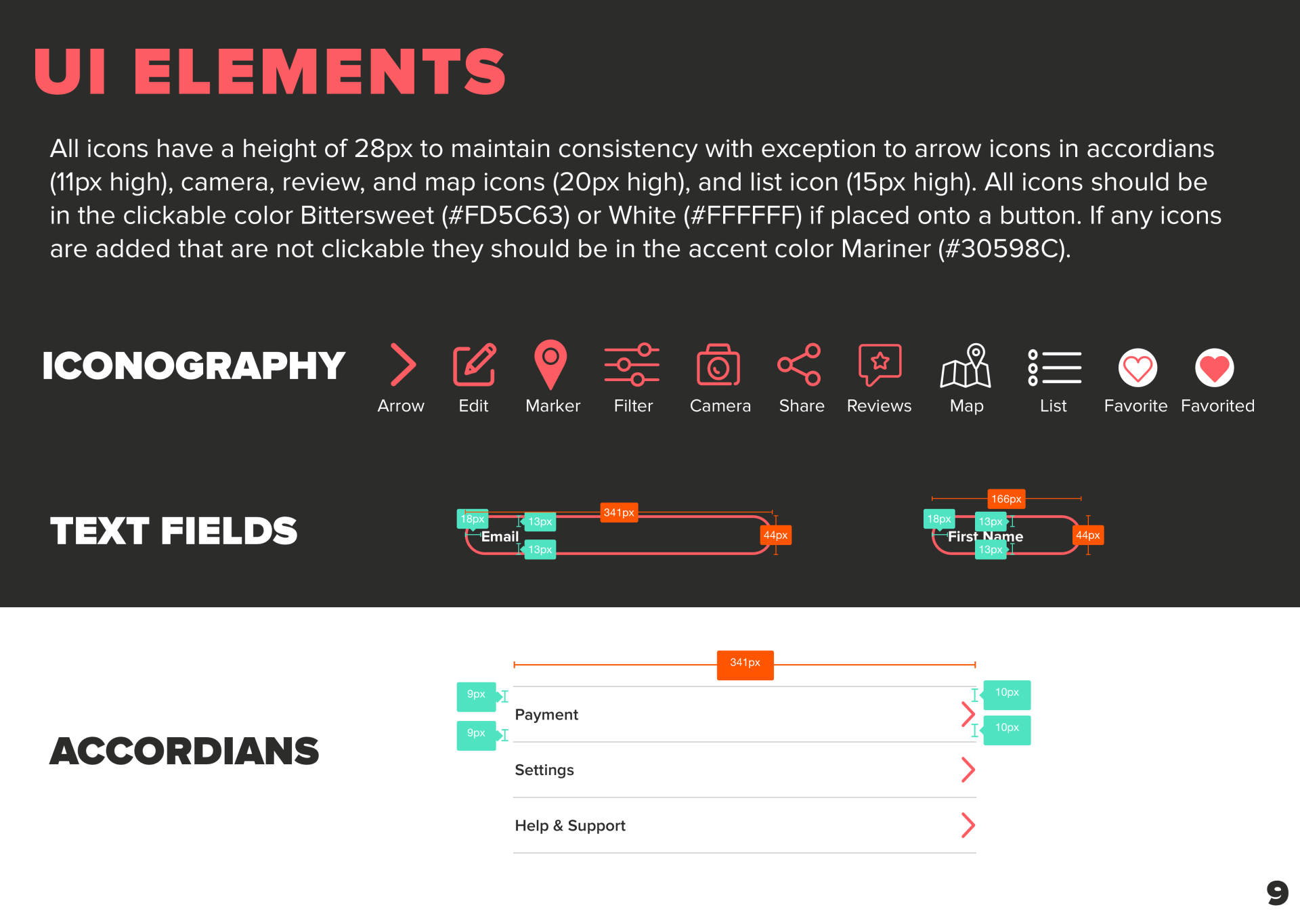
Slide title
Write your caption hereButton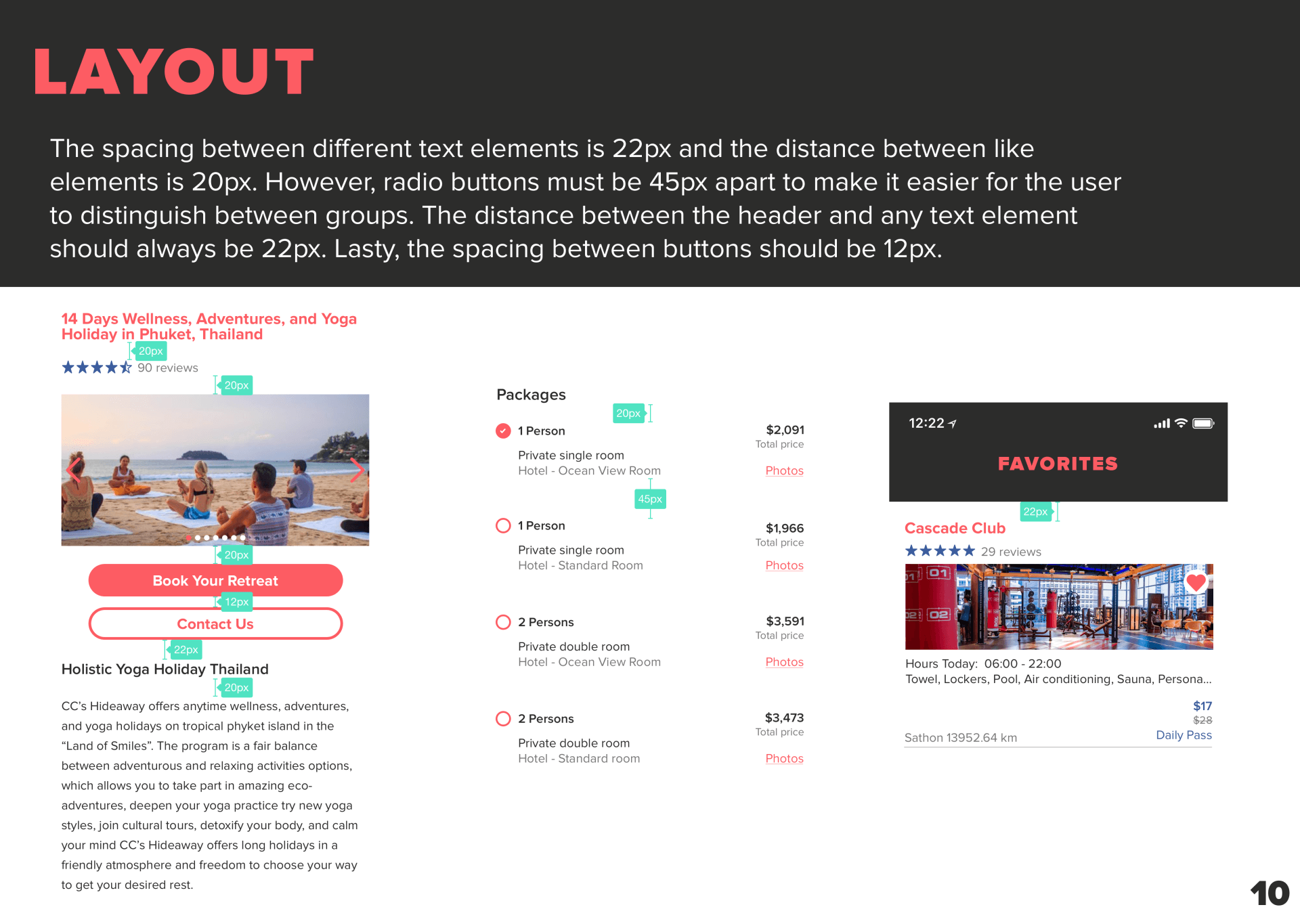
Slide title
Write your caption hereButton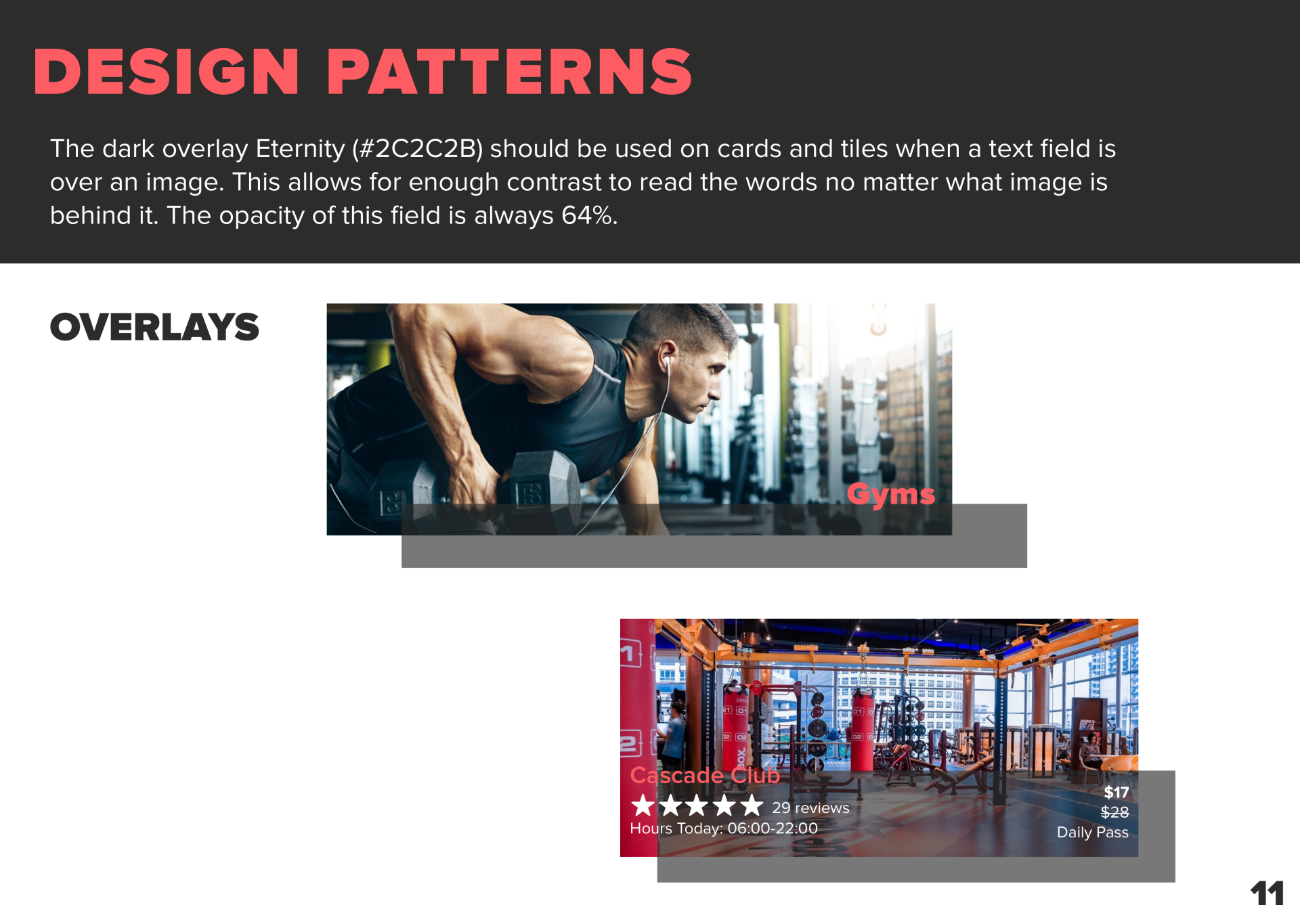
Slide title
Write your caption hereButton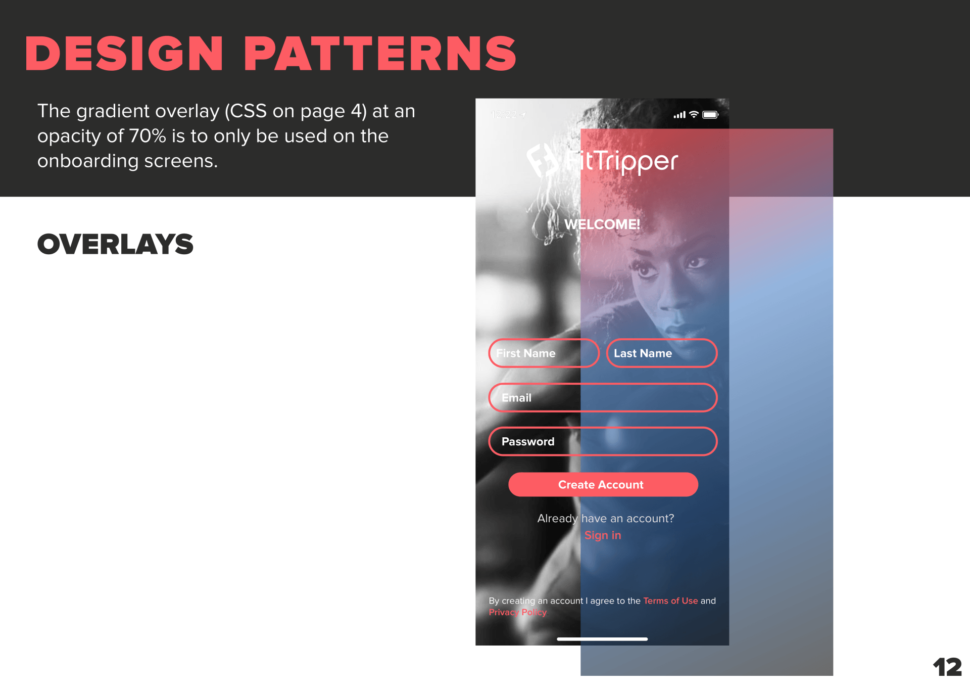
Slide title
Write your caption hereButton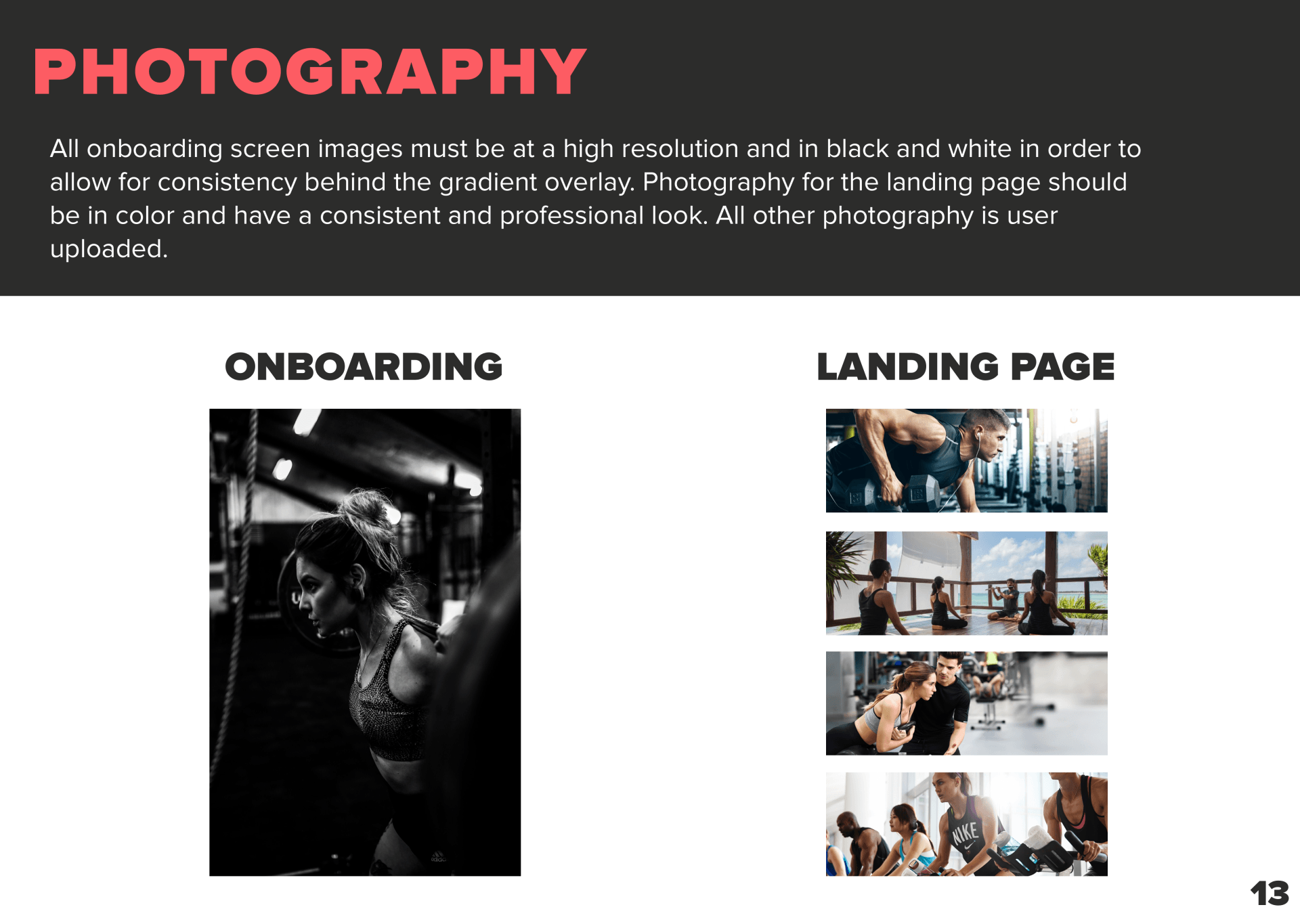
Slide title
Write your caption hereButton
FUTURE RECOMMENDATIONS
Given more time I would've liked to explore the below features to bring FitTripper to the next level.
Microinteractions would be a great way to make FitTripper even more dynamic. An animation I would recommend is giving the bar under the “Upcoming” and “History” tabs on the schedule screen a bounce effect when toggling. This is a simple yet fun microinteraction that could elevate this otherwise simple screen.
Through our research on other projects as well as this one our team found that users love to get rewarded for using an app. It would be great to implement some sort of reward system for users that leave reviews or for users who use the app frequently. This is a great way to keep users involved with FitTripper.
In our second round of testing one user mentioned adding a video clip onto the onboarding screens. I thought this was a great suggestions. Drawing the user in on the first screen with a short clip of people working out would be a great motivation tool.
