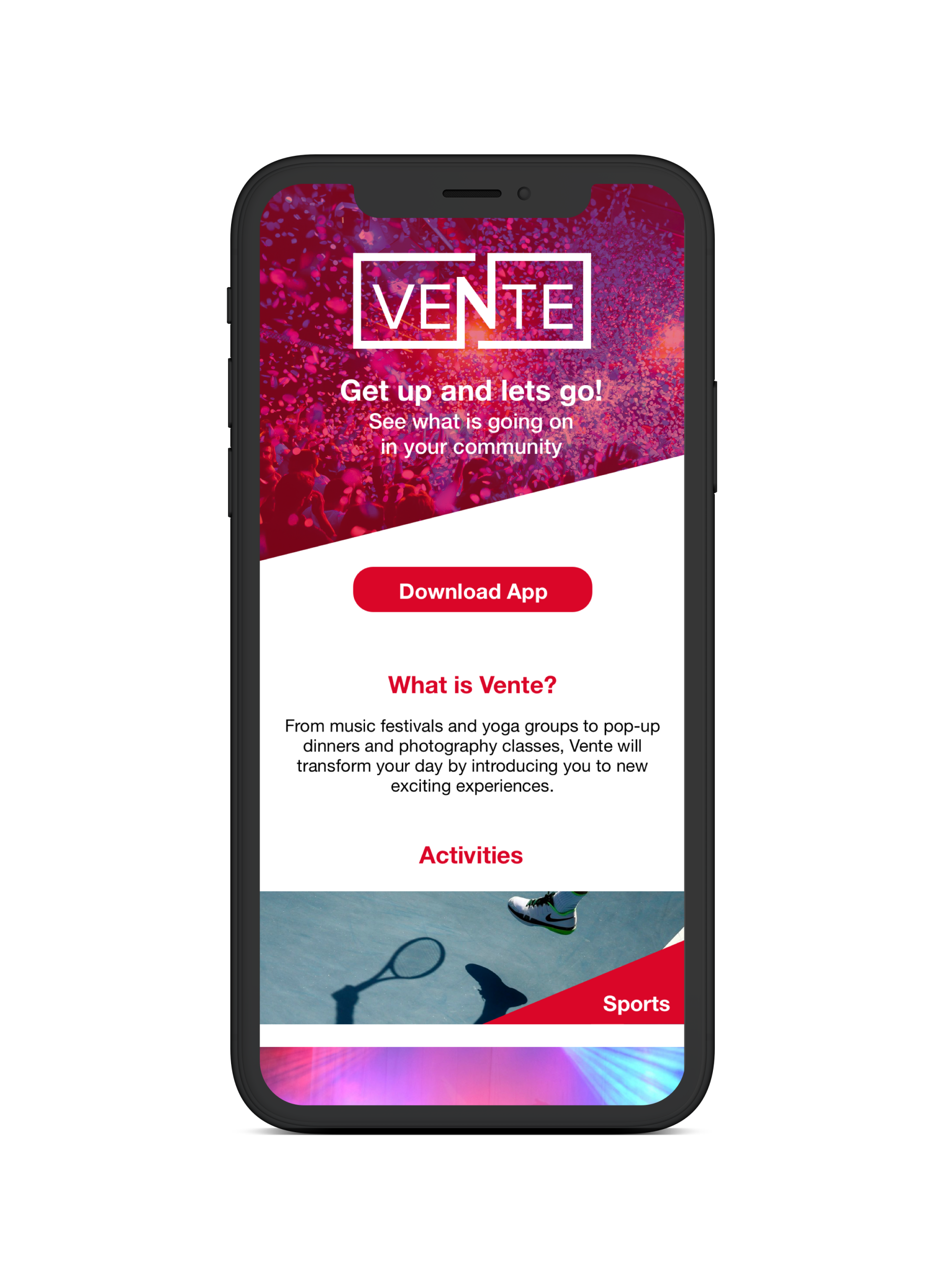
Vente

The local scene is experiencing an overload of shareable information. Today’s consumers are over saturated with local events, meet-ups, and group activities. Despite the endless sea of happenings, people continue their struggle to find activities that align with their personal interests.
Role
UX/UI Designer
Key Tasks
Qualitative and Quantitative Research
Style Tiles
Logo Development
User Testing
High Fidelity Designs
Prototyping
Responsive Marketing Site
Style Guide
Timeframe
5 Weeks
CHALLENGE
To create the visual design for a mobile responsive platform that reimagines how people can search and find activities that reflect their interests.
APPROACH
I began my research with a Visual Competitive Analysis, looking at six direct competitors: Thrillist, Meetup, Eventbrite, Facebook, Eventzilla, and Groupspaces. Below I'm focusing on what I found to be the most effective designs.
VISUAL COMPETITIVE ANALYSIS
- Design is fun, young, and urban
- Emphasis on imagery and video content
- Layouts consist of cards, grids, and carousels
- Logo and CTA is red
- Design is colorful, friendly, and warm
- Content focuses on joining groups within your local community
- Welcoming photography and videography
- Design is young, urban, and adventurous
- High contrast colors with lots of white space
- Illustrations that add a a fun flare
- Logo and CTA colors are orange while purple is used as a secondary color for accent and typography
GOALS
Make the app appear fun and inspiring by using a lot of photography and high contrast coloring
Give photography a big role in grabbing the user's attention
Use consistent typography to make the whole app uniform and organized
Use sans-serif fonts to keep it young and fresh
Use white space to keep the site clean while also bringing attention to imagery and colors
Make the logo and CTA color consistent
Give photography a big role in grabbing the user's attention
Use consistent typography to make the whole app uniform and organized
Use sans-serif fonts to keep it young and fresh
Use white space to keep the site clean while also bringing attention to imagery and colors
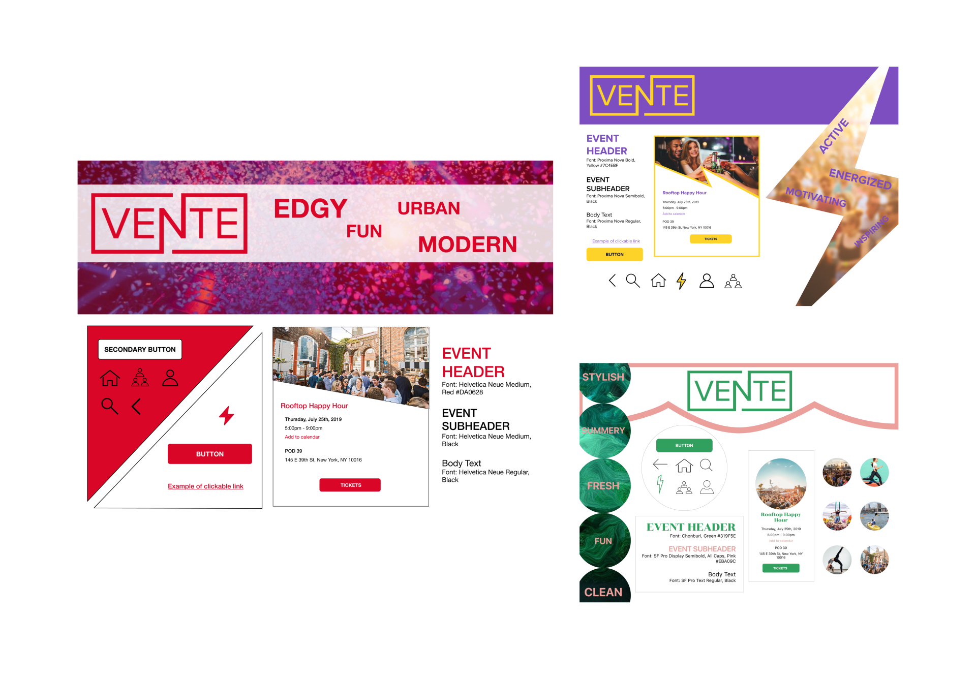
LOGO
I began this process with sketching and eventually narrowed down to three final designs.

The extension of the "n" that wraps around "Vente" is meant to to unify the word. Vente is an app built to bring people together and this logo is meant to represent exactly that, the unifying of a community.

As Vente is targeting urban cities I thought the concept of a recognizable building behind the "t" could be a fun way to personalize the logo. The building could change depending on the location of the user.

This logo is simple and easy to understand as it relates to the concept of ticketed events. I wanted to play of the "n" as it is the centerpiece of the word.
FINAL LOGO
The below concept was chosen due to its versatility and simple design. This logo can continue to be used throughout Vente’s changes, it's timeless.
SOLUTION
The next step in my design process was to create three divergent style tiles to get quick feedback before building high fidelity screens. For my first style on the left I wanted an edgy and fun look, taking style points from Thrillist but making it even more dynamic. For the second style I wanted to incorporate a lightning bolt to symbolize energy. For the final style I went for a summery and chic look. The style that was chosen for Vente was the one on the left. I then proceeded to analyze the wireframes and create high fidelity screens.
WIREFRAMES TO HIGH FIDELITY SCREENS
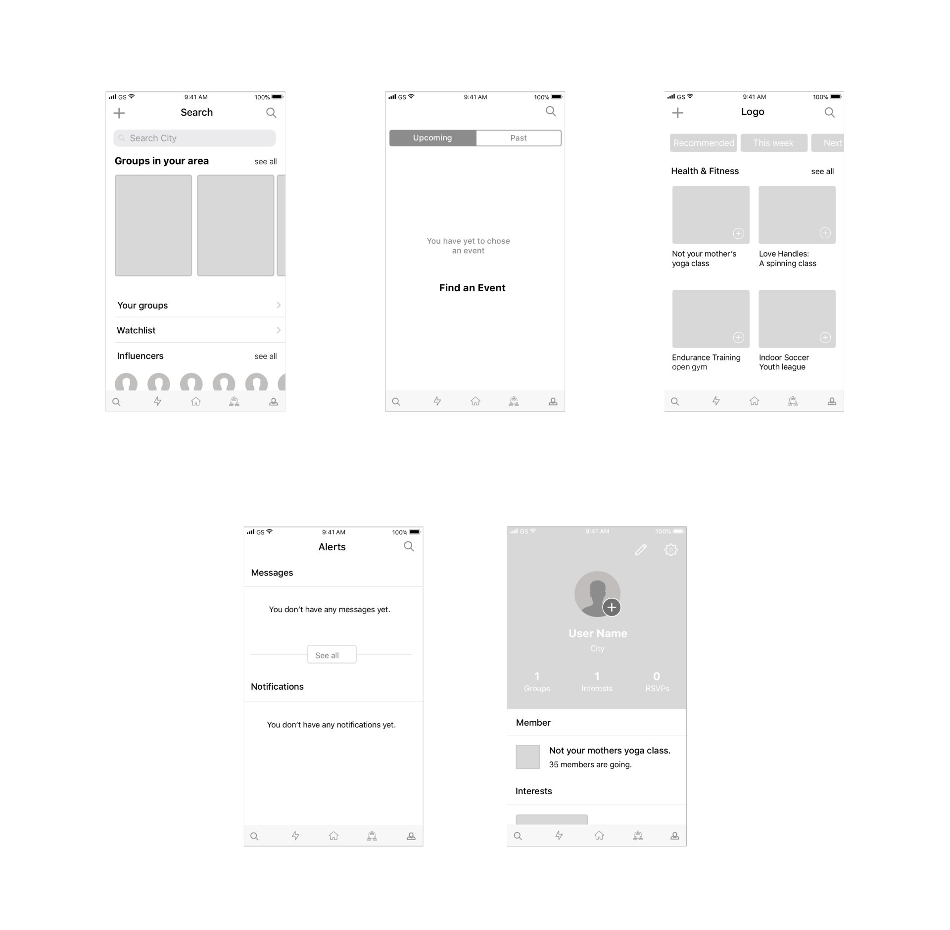
01
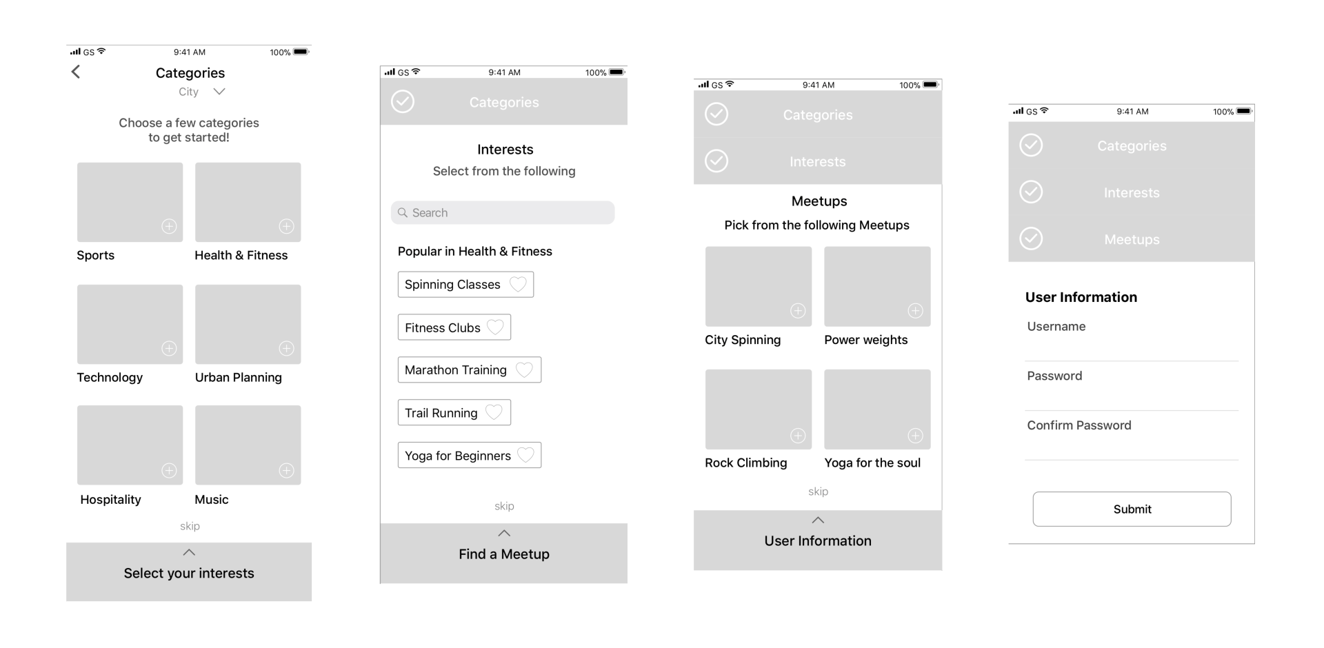
Wireframes
These were the wireframes given to me by a UX team. However, I had some iterations in mind. The Interests screen could've been organized in a way to allow for more information to make it onto the screen. I also felt that the Meetups screen could've been overwhelming for users because at this point they wouldn't be clear what a meetup is. The user might've been hesitant to go any further in fear they might be automatically signed up for something.
02
Iterations
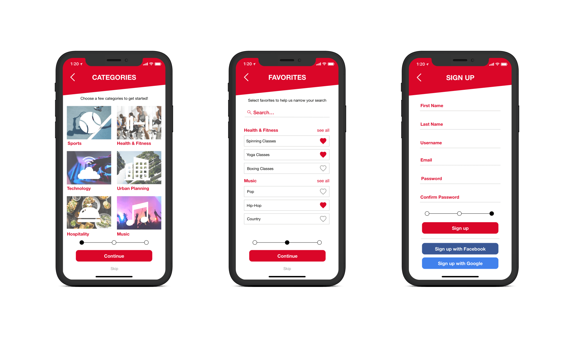
For the iterations on the high fidelity screens I decided to remove the accordion and replaced it with a simple swipe menu. I did this to give the user validation that they've completed a task and could hit continue to move on. I also decided to remove the location request on the Categories screen and would instead insert this as a pop-up once the user has made an account. Next, on the Favorites screen I added categories as well as "see all" buttons so the user can look through specific option from the categories they selected. I removed the Meetups page because the four screen onboarding seemed too long and Meetups could be an intimidating section to some users who don't want to be part of a group. The last screen is the signup screen which I iterated on by adding in more information fields such as an email address. I also decided to change the button text from "submit" to "signup".
03
Wireframes
There were many areas of opportunty to elevate these main screens. Issues that I saw were:
There were two search icons - one on the top right corner and one in the navigation
Some screens had titles while others didn't
There were generally too many different tasks and options on each screen making it unclear of the exact purpose of each screen was
Some screens had titles while others didn't
There were generally too many different tasks and options on each screen making it unclear of the exact purpose of each screen was
My goal was to make this app more intuitive and easy to use while also making it look great.
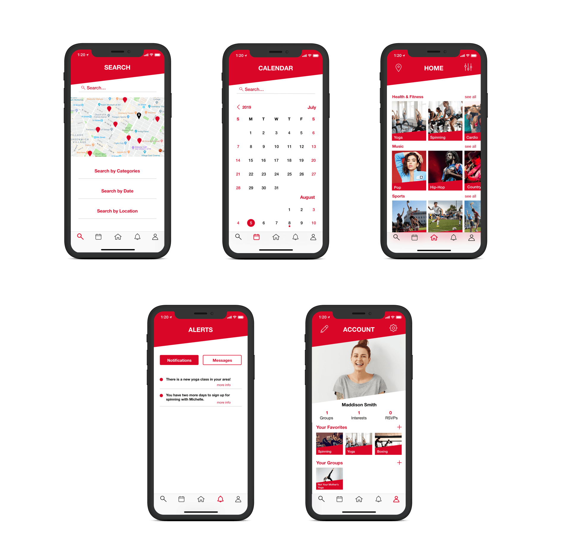
04
Iterations
For the Search screen I wanted the user to be able to easily search for events and activities depending on categories, date, or location. Once they signed up for an activity or event it would be added to their calendar. I felt the Calendar screen was familiar and easy for users to scroll through and see what was on their schedule. As for the Home screen I wanted to focus on images and use a carousel to allow users to scroll through the categories they selected during onboarding. Users can also change their location as well as add filters. The Alerts screen on the wireframes was a bit unclear on how information would be filled in, I thought adding tabs for Notifications and Messages would be an easier way to sort information. The Account screen is meant to be an easy way to check and edit the users Favorites and Groups while also maintaining the dynamic shapes that is displayed throughout.
PROTOTYPE

MARKETING SITE

FUTURE RECOMMENDATIONS
Social Feature
Given more time I would've liked to have worked in a social media feature into Vente. It would be great for users to be able to share their events and activities on social media.
Calendar
I think the Calendar screen could be elevated by adding a feature that allows users to scroll through days to see what is happening at that time. This could possibly be added as a tab or filter option.