Voluntopia
VOLUNTOPIA
VOLUNTOPIA
Voluntopia aims to get users excited about microvolunteering, while also encouraging real-world impacts via digital rewards. This is a gamified product that aggregates microvolunteering services to be completed in the real world in order to incentivize time-strapped users to continue engaging in volunteer opportunities by being able to unlock more and more features as they volunteer.
Role
UI Designer
Key Tasks
Qualitative and Quantitative Research
Style Tiles
User Testing
High Fidelity Designs
Prototyping
Animations/Microinteractions
Style Guide and UI Kit
Timeframe
5 Weeks
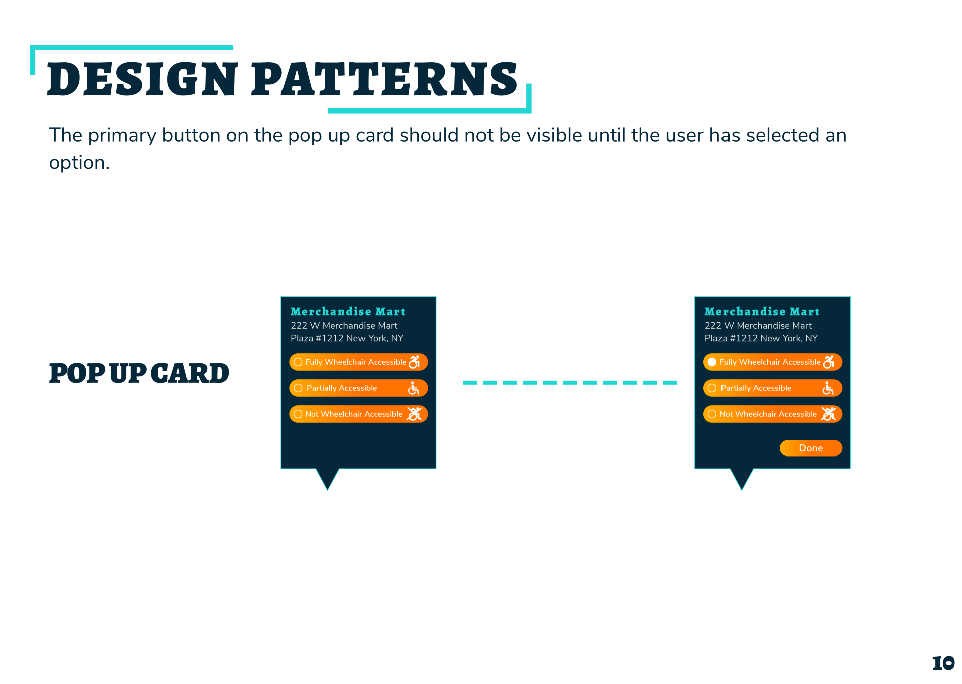
CHALLENGE
The user interface design of this product needed to evoke positive emotions towards volunteering while being accessible to mobile users on the go. I needed to accomplish the following:
Establish and extend the brand experience
Establish clear navigation and interaction to maximize users’ time
Define a scalable design system that ensures future consistency and alignment
Engage with users via microinteractions and/or animations
Create a product that integrates easily into users’ lives and other social networks
Deliver a visual brand experience that encourages users to get involved
Establish clear navigation and interaction to maximize users’ time
Define a scalable design system that ensures future consistency and alignment
Engage with users via microinteractions and/or animations
Create a product that integrates easily into users’ lives and other social networks
BRAND PRINCIPLES
Catalyze
Spark an interest
Simplify
Cut through the noise, curate the experience
Retain
Keep users engaged and coming back for more
APPROACH
Our team began our research with a Visual Competitive Analysis, looking at three direct competitors: ThatHelps, JustServe, and VolunteerMatch. After synthesizing our findings from this analysis as well as keeping our client's needs in mind we created three Design Principles.
VISUAL COMPETITIVE ANALYSIS
- Good hierarchy
- Great use of whitespace
- Engaging animations
- Primary color is orange

- Nice iconography
- Engaging microinteractions
- Easily to use navigation
- Primary color is orange
- Good use of whitespace
- Needs more consistent usage of primary and secondary colors
- Could use better hierarchy
- Primary color is orange
DESIGN PRINCIPLES

Divergent Color Palette
All competitors use orange as a primary color. A divergent color palette should be used to stand out amongst competitors. Keep the user engaged with a new and exciting look.

Illustrations
Incorporate illustrations into design to add a personal touch. Make the user feel that this is more than just an app, it is their community.

Microinteractions
Incorporate microinteractions and animations to keep the interface fun and interesting. However, make sure not to over do it and make it difficult for the users to get to their goal.
SOLUTION
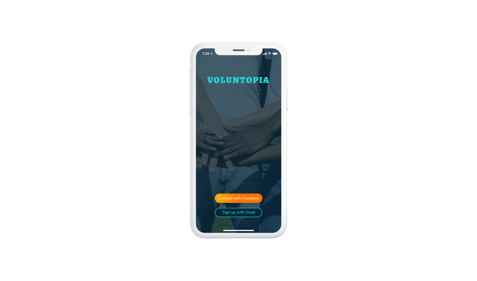
The next step in my design process was to create three divergent style tiles to get quick feedback from users before building high fidelity screens. I wanted to do one tile that incorporated orange but aimed to use it in a different way from our competitors. My second tile was a minimalist, earthy look while the third was urban and edgy.
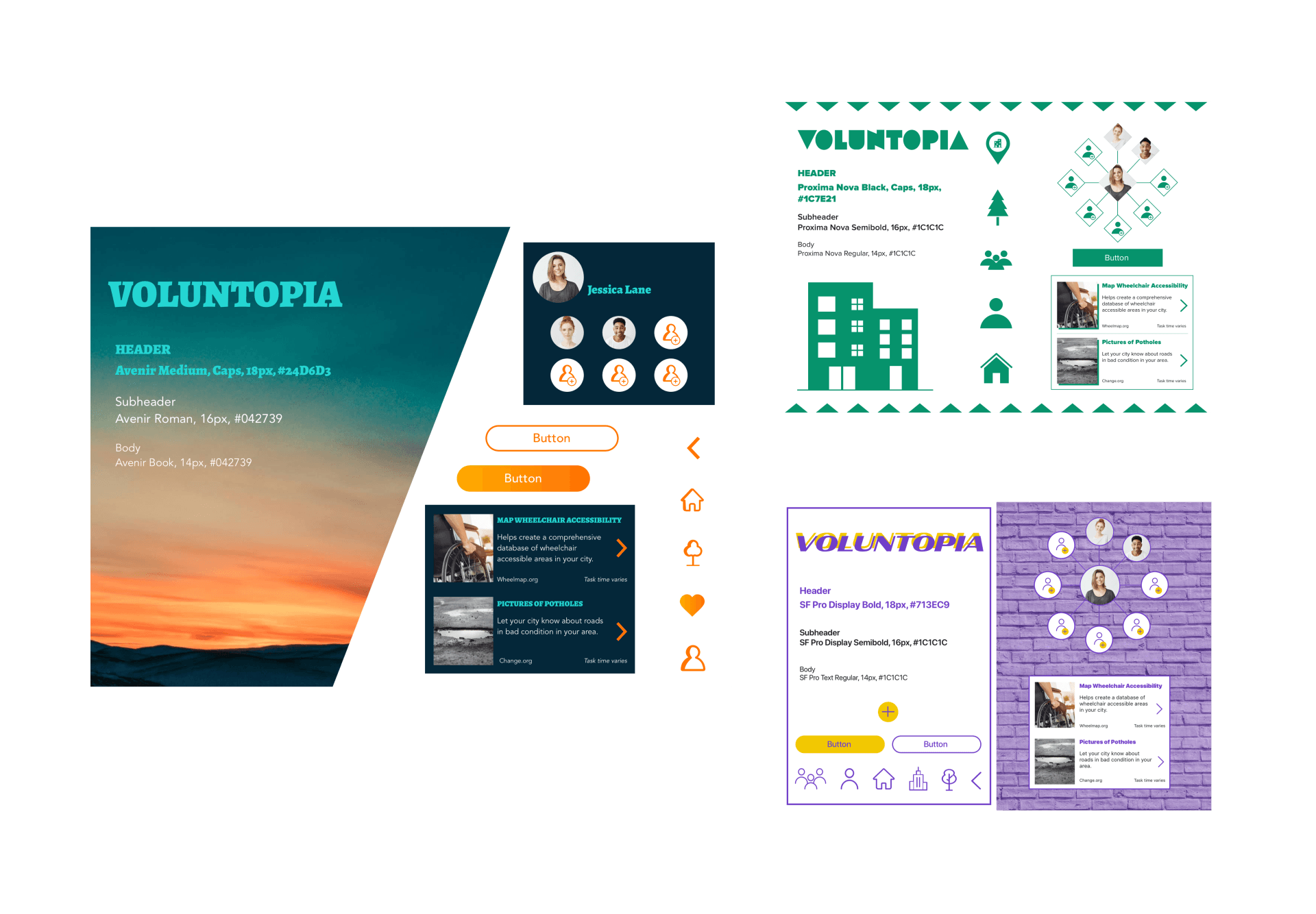
User Feedback
90% of users preferred the style tile on the left due to its fun colors and warm gradients. Users mentioned that the orange was a nice warm contrast against the cold background. My thought process behind this was to show how volunteering can bring light to what could otherwise be a dark urban city. As users responded well to this style tile I moved forward with this design direction.
DESIGN PROCESS
01
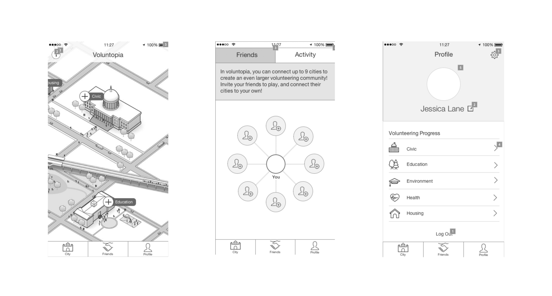
Wireframes
These were the wireframes given to me by a UX team. However, I wasn't given any data on user testing and because of this I decided to not stray too far away from the original design as I moved into testing the high fidelity screens.
02
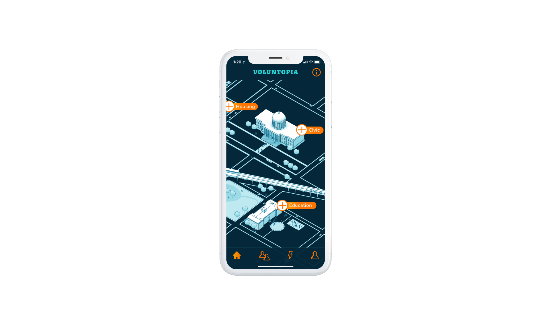
Initial
Designs
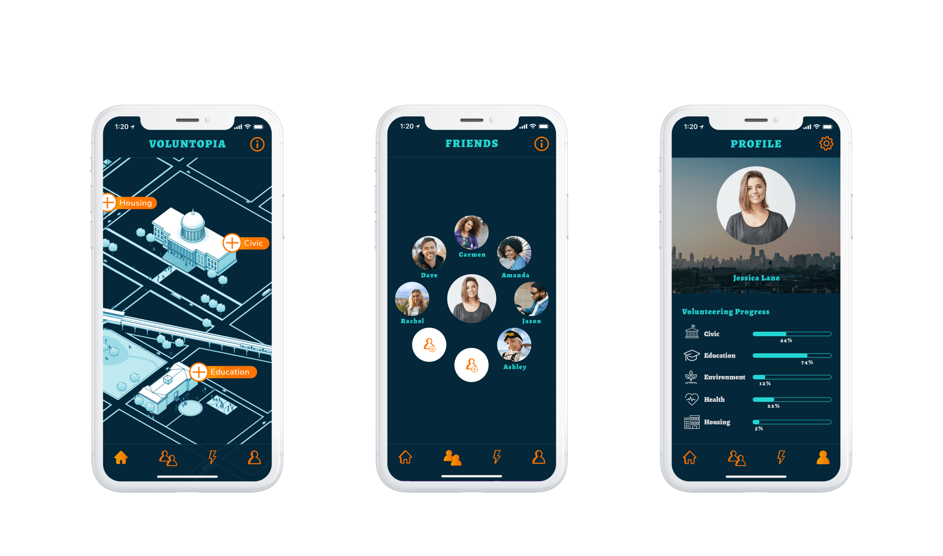
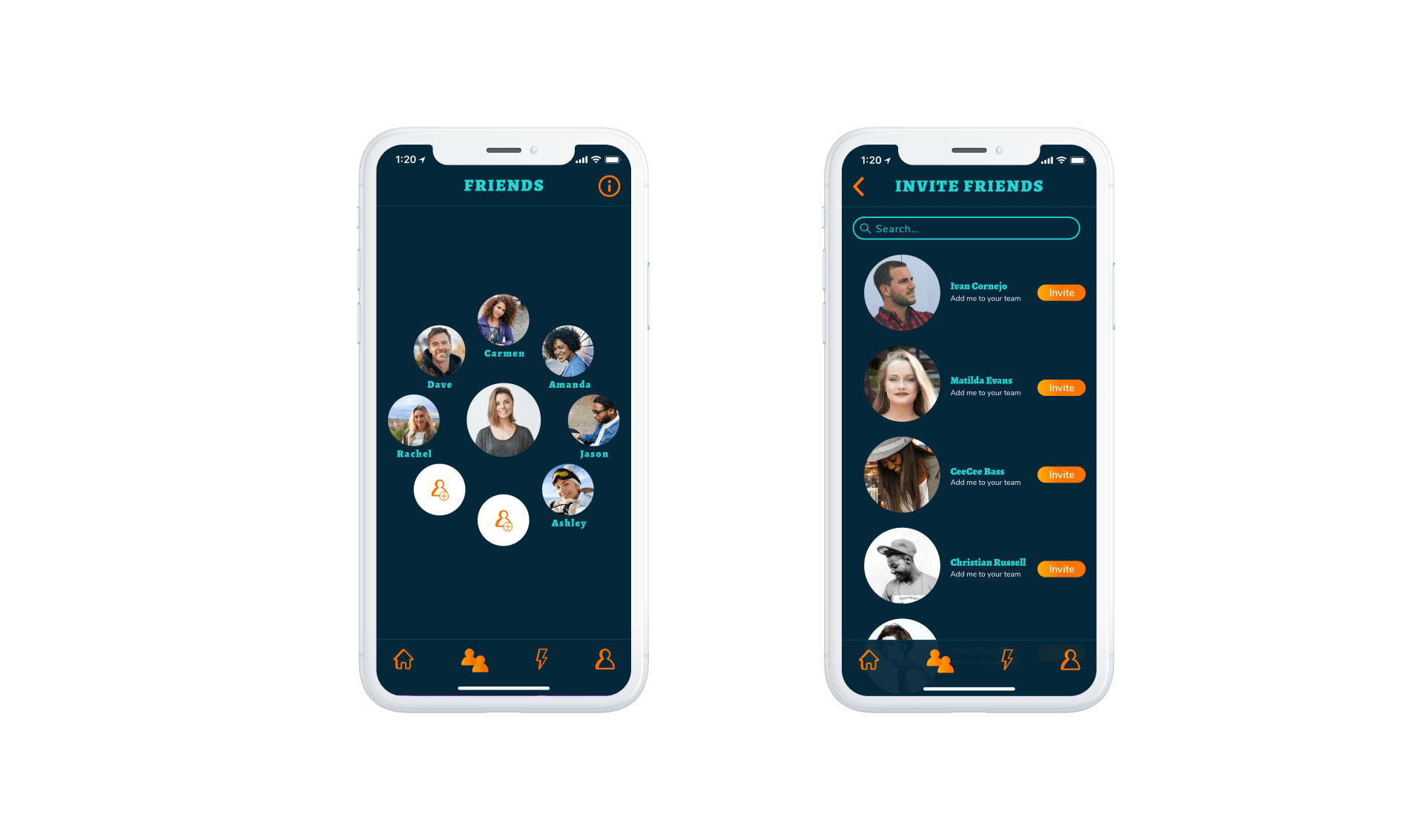
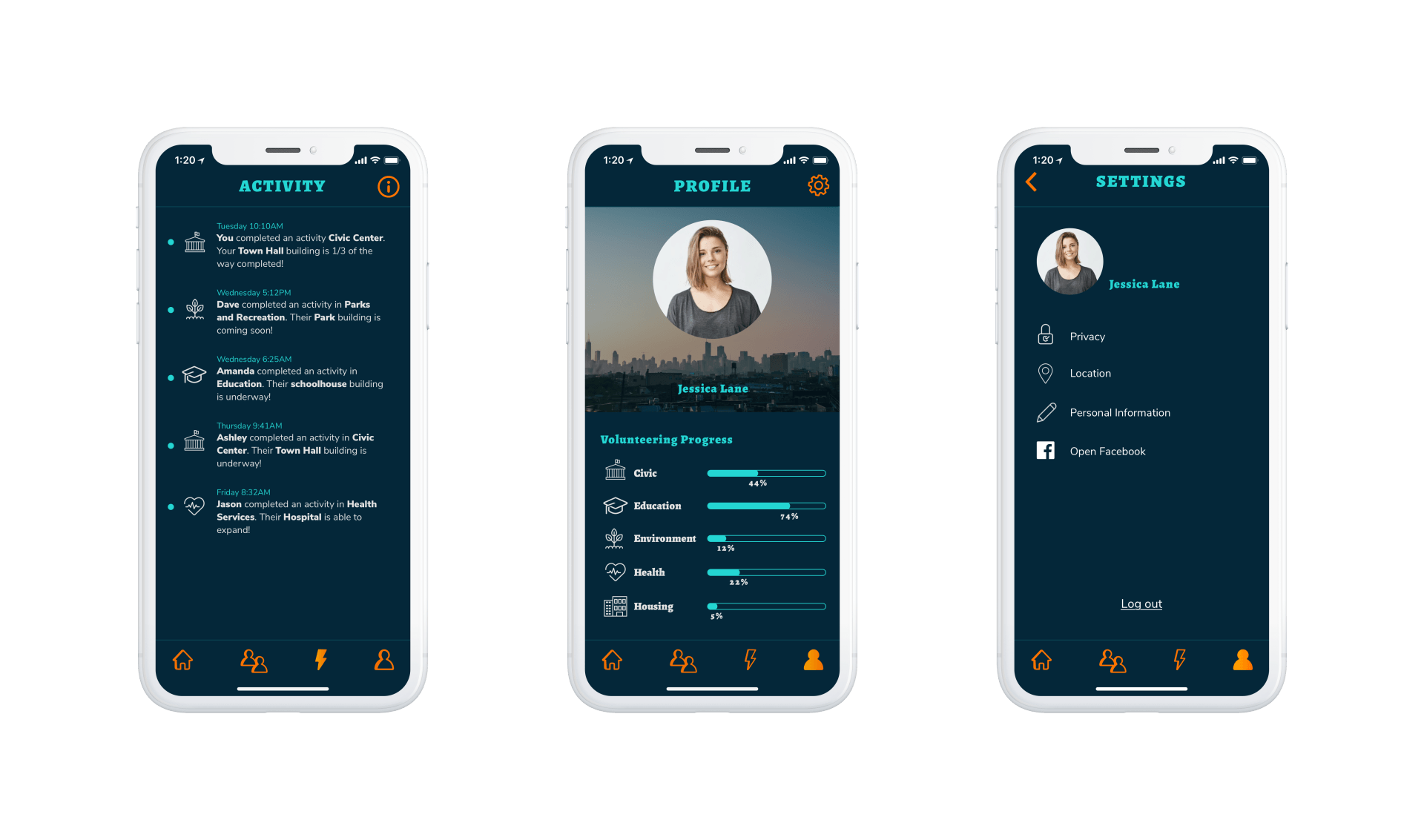
I liked the 3D effect of the map from the original wireframes so I decided to move forward with this with adding in my color scheme. I wanted the map to be on a dark background to be consistent with the rest of the interface. As for the Friends screen I made an iteration from the wireframes off the bat. I felt that activity and friends should be broken up into two different screens. Having the Activity and Friends on the same screen made it appear to users that only their friend's activity was being displayed, which wasn't the case. Lastly, I maintained the same layout on the Profile screen from the wireframes to see if the volunteering progress was intuitive to users.
03
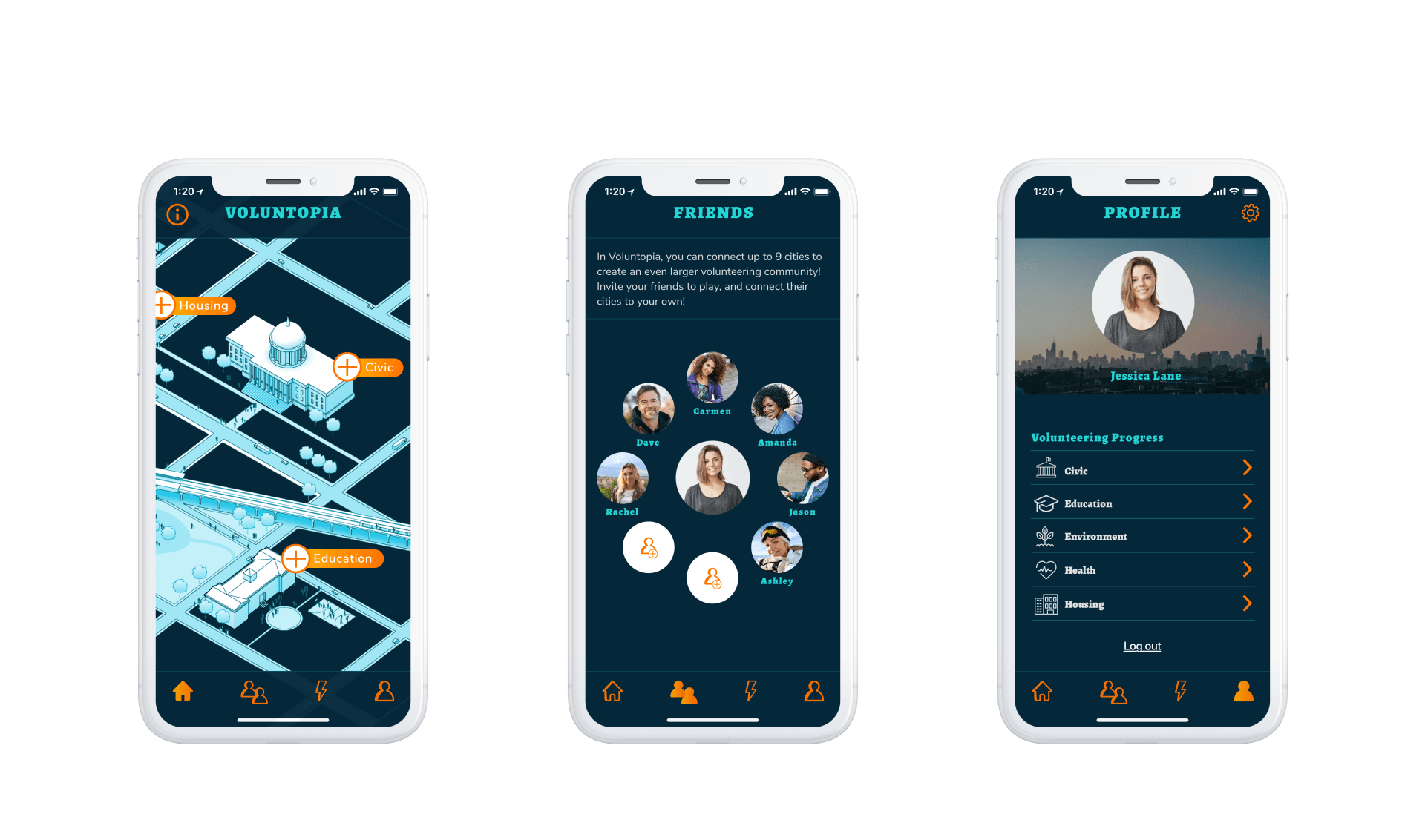
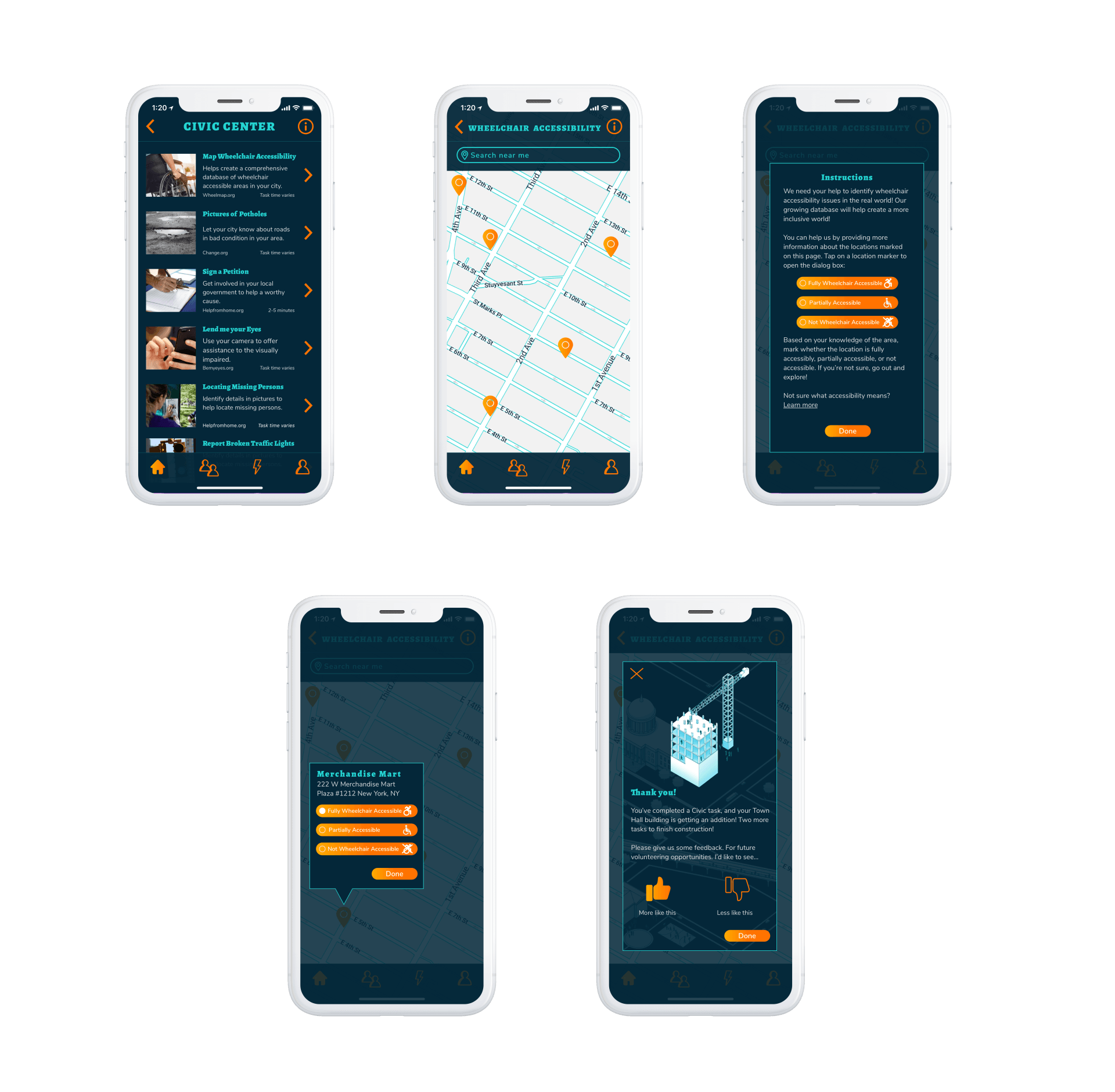
Final Round
After gathering user feedback I made final iterations. Users felt that the Map was cluttered, mostly indicating to the color of the roads. I iterated on this to give the roads a light blue outline instead of completely blue. This iteration tested fantastically in the second round as users liked the high quality and innovative look of the Map. The Friends screen was received well, users preferring Friends having its own screen rather than a tab with Activity. Users felt that the repetition of instructions wasn't necessary so I put in an info icon to allow users to read the instructions if they wanted to. Lastly, the Profile screen was said to be confusing. They weren't clear on what the arrows for progress would lead to. I decided to add in progress bars instead so users can track their progress at a glance. Users also really liked the image behind the profile picture so I decided to hide the log out button in settings to allow for extra space on the screen.
FINAL SCREENS
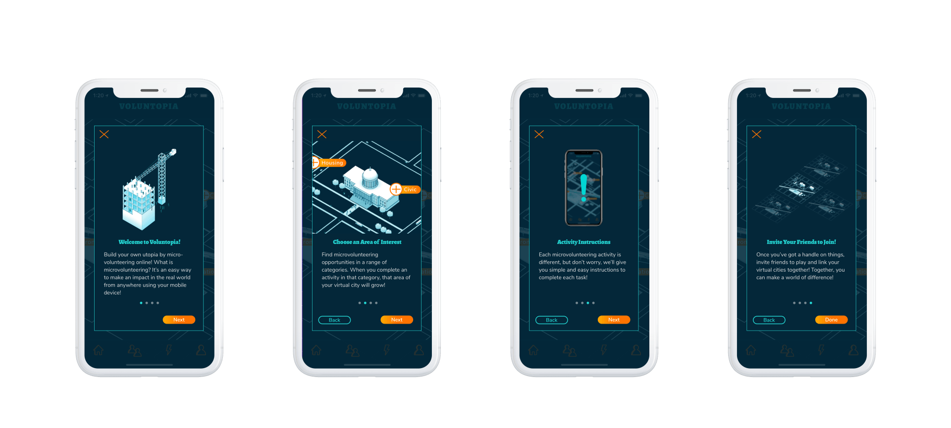
MICROINTERACTIONS AND ANIMATIONS


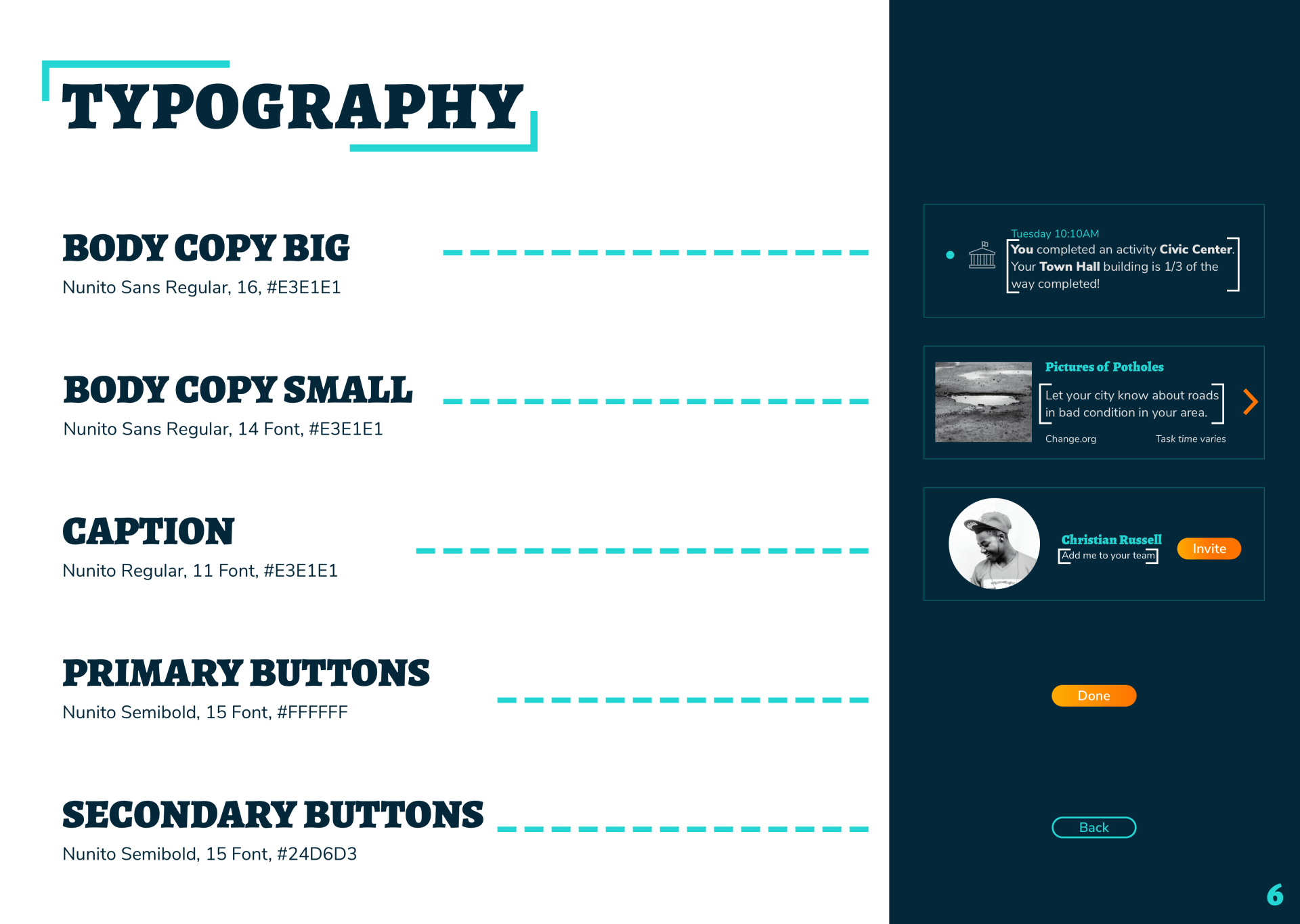
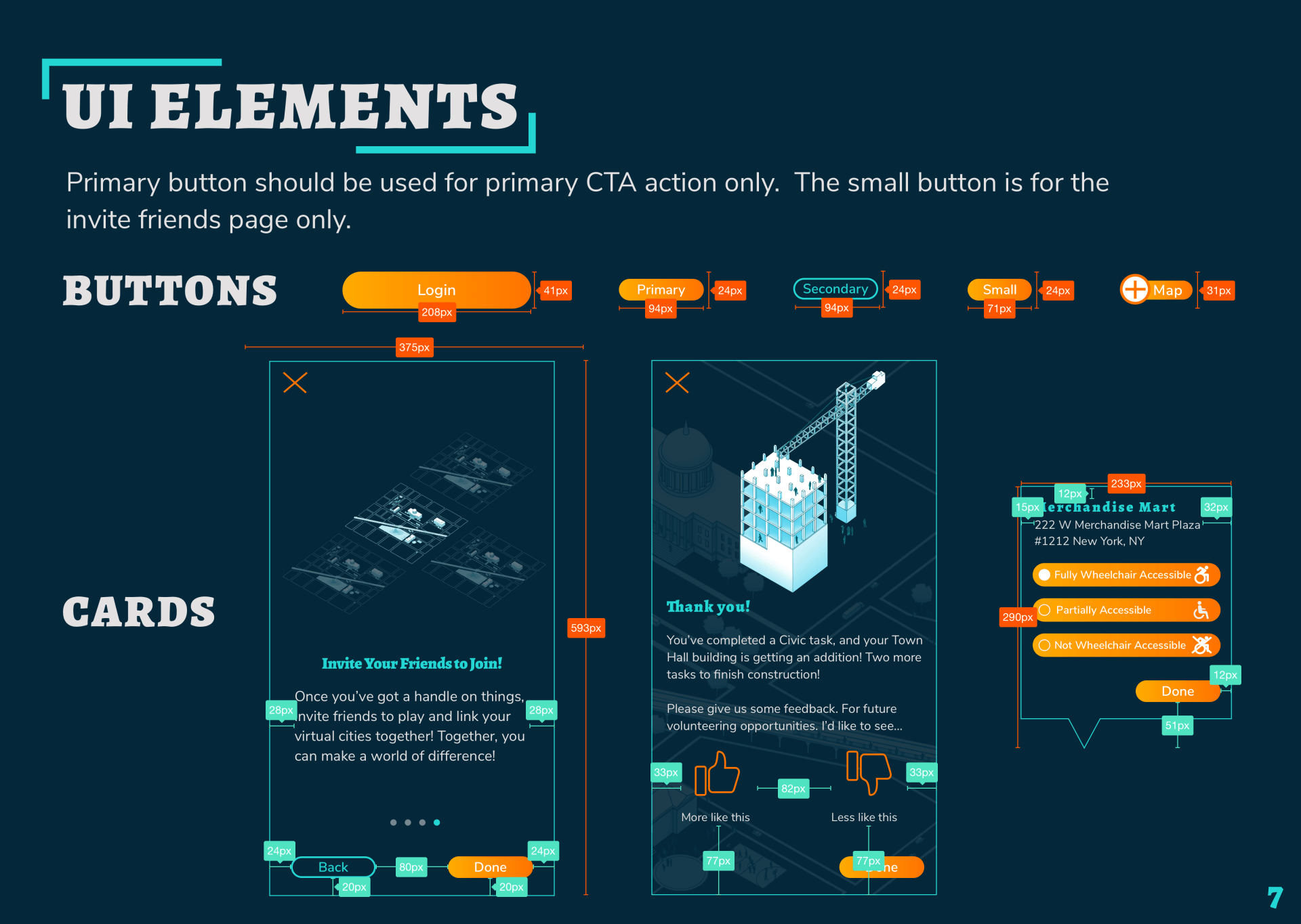
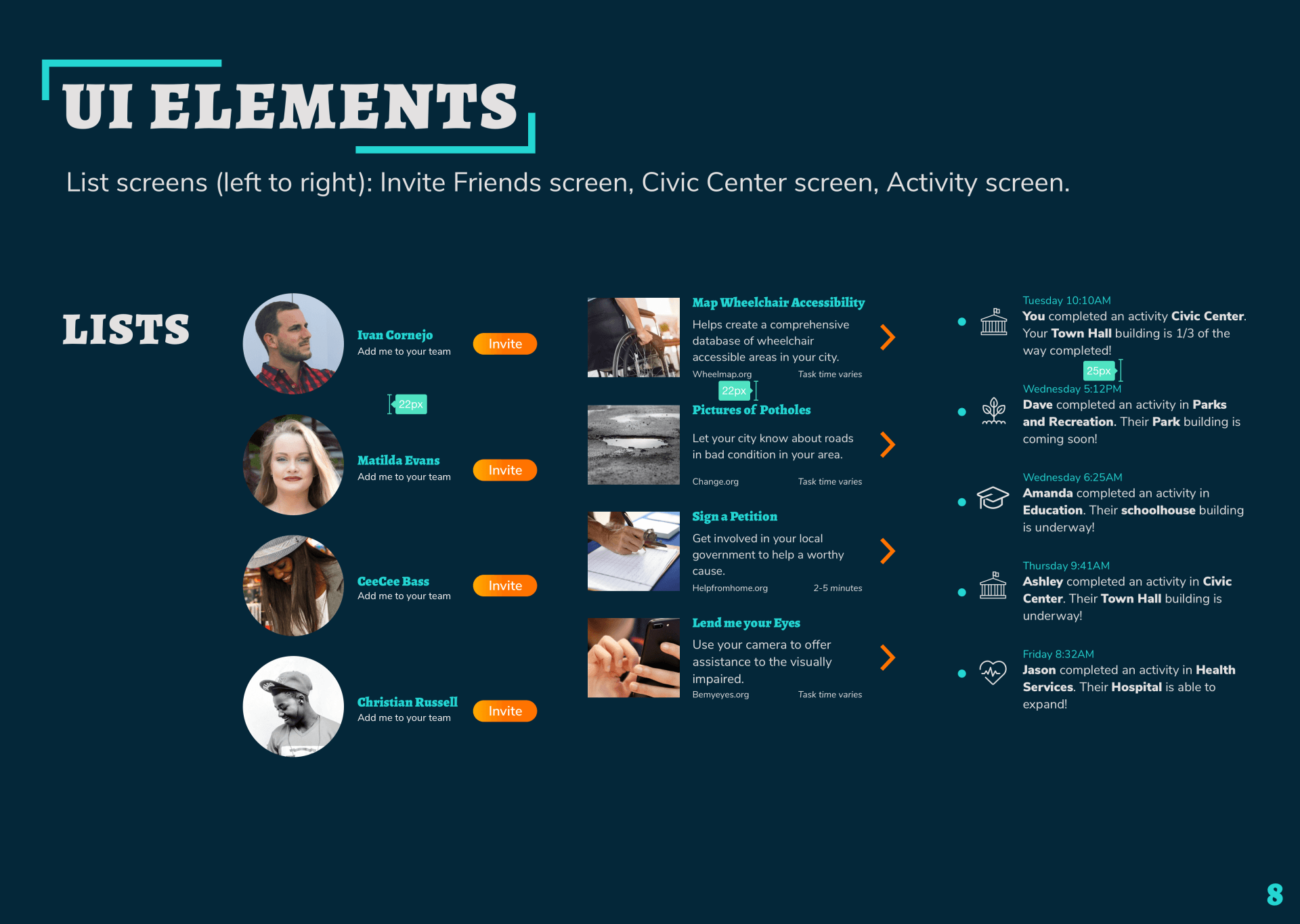
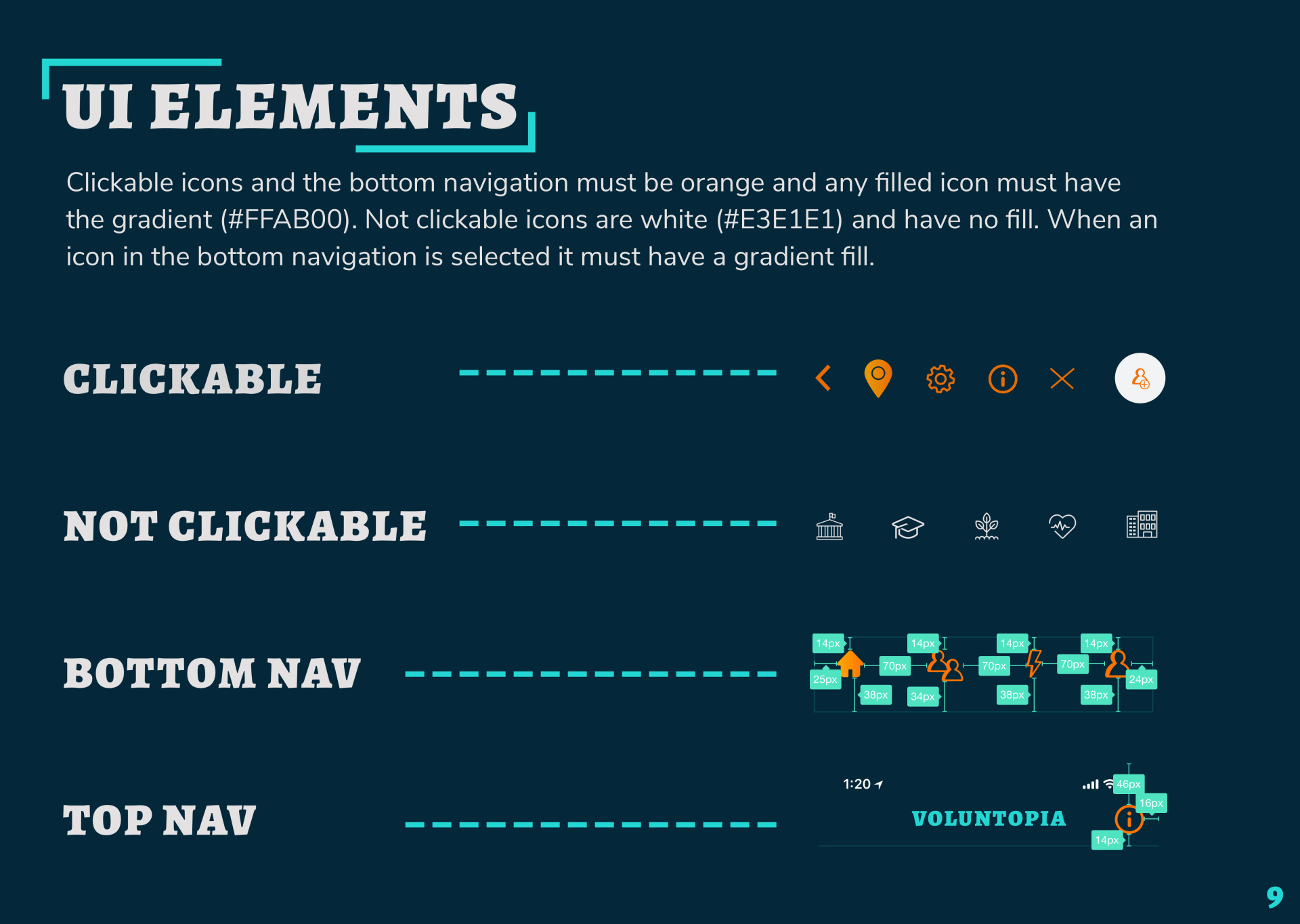
STYLE GUIDE
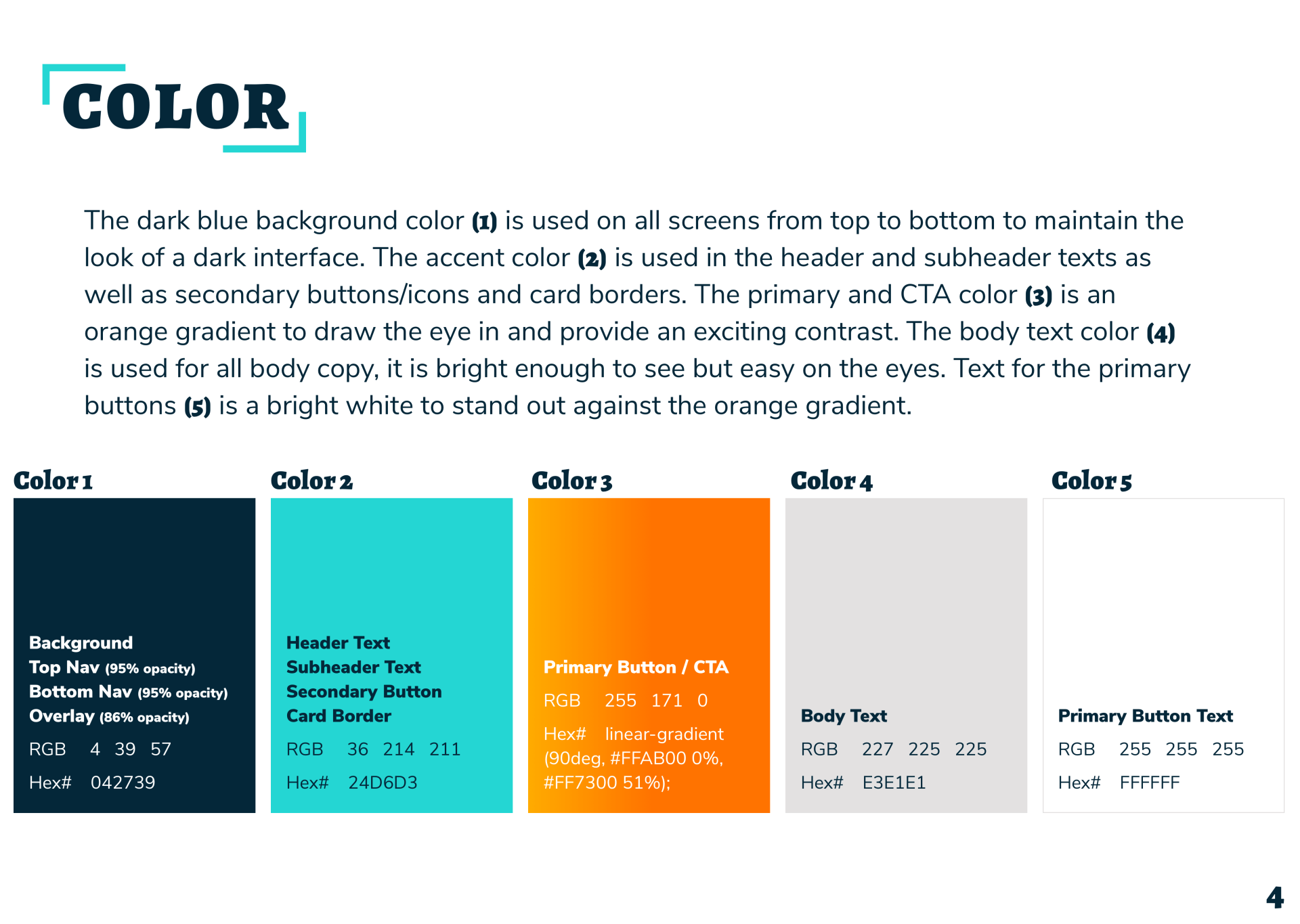
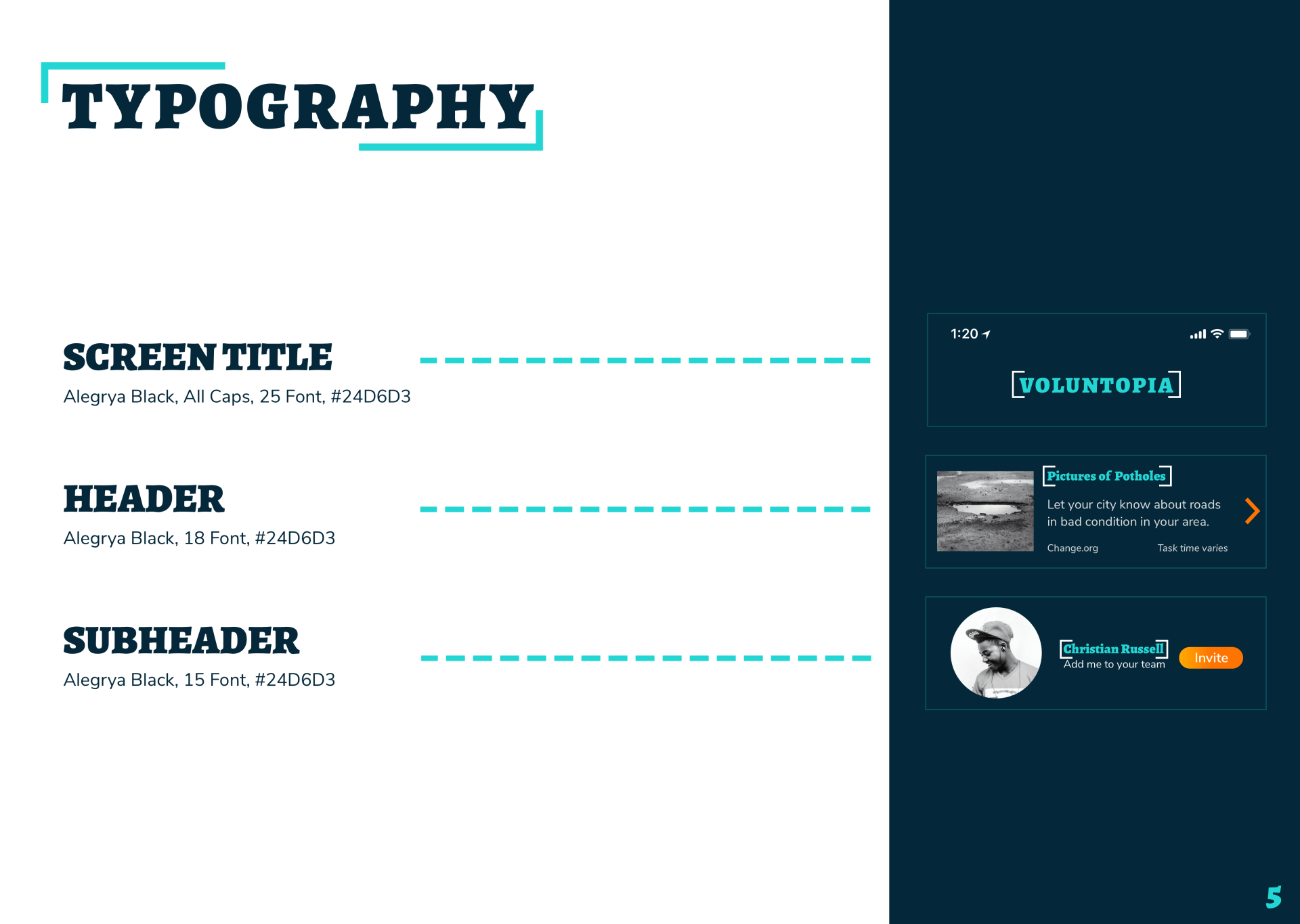
I created a style guide to facilitate an easy handoff to developers. This guide provides a comprehensive design system that Voluntopia can implement across all platforms.
FUTURE RECOMMENDATIONS
Profile Screen
Given more time I believe the volunteering progress function needs further work and testing. During testing users had questions about what will happen when they reach 100% in a category. A level system should be created so they can complete challenges and move up. Otherwise it’ll appear to users that there is an end to the game.
Friends Screen
The friends screen can be made more interactive. In user testing we received some great feedback on how to make this page a competitive tool. If the user can see what level their friends were on and if they’ve made recent progress it could be motivating to try and surpass them. Maybe they get stars or crowns for each new feat.
Activity Screen
There had been a few callouts in user testing regarding the activity function and if there should be a differentiating factor between friends activity and personal activity. The activity screen can be broken up into tabs, one for friends and one for personal. Another option is to have a personal activity section on the profile screen.